9個很棒的CSS邊框技巧,對你的樣式設計有重要幫助
如果您是前端開發人員,那么幾乎每天都會使用CSS邊框。我發現了一些可以在您的項目中使用的有用的技巧。
開始吧!
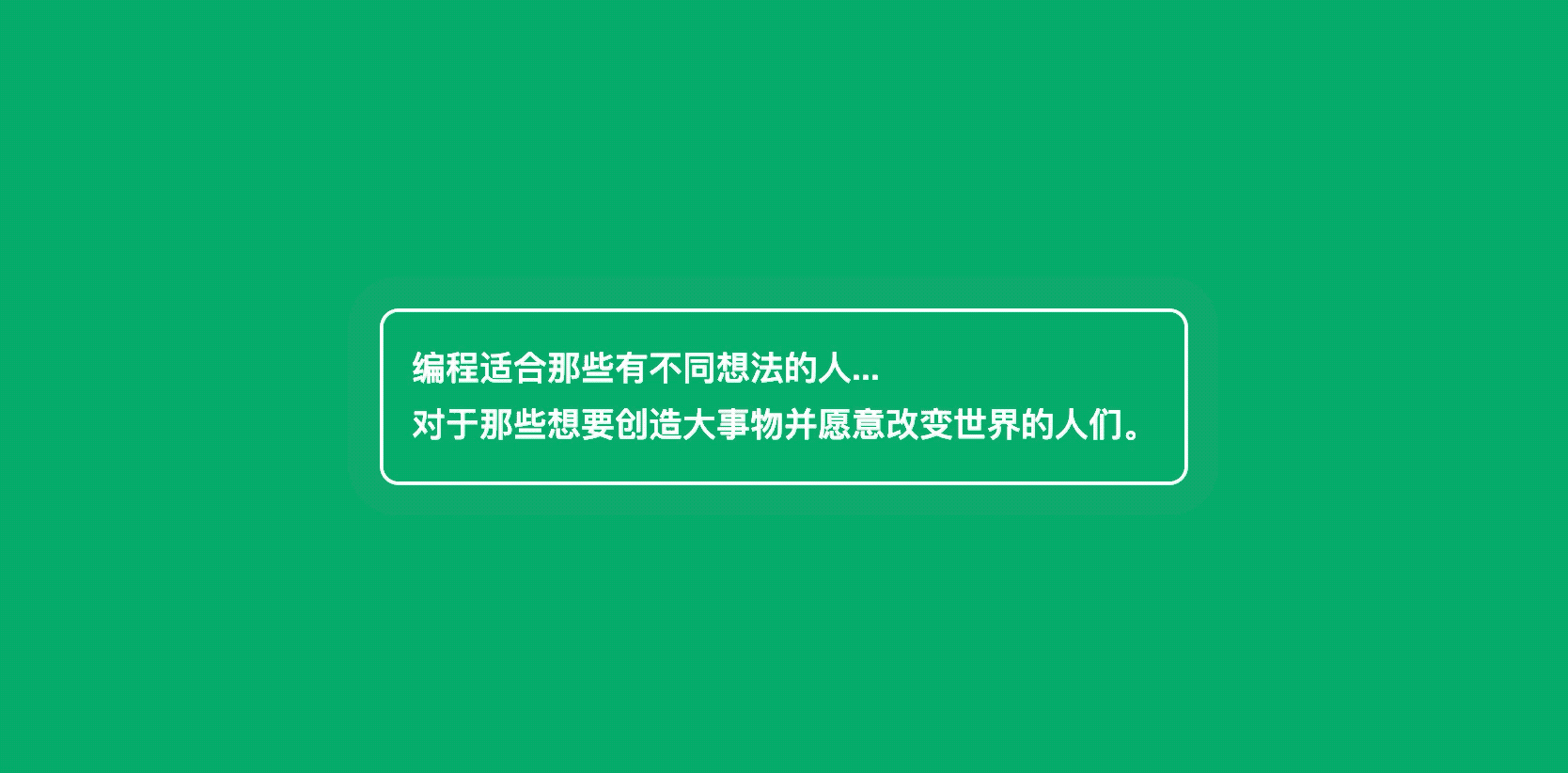
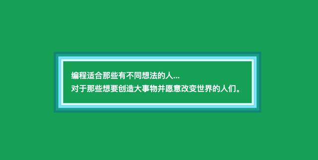
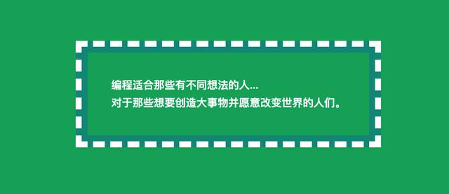
1. 動畫CSS邊框
當我們想使我們的項目更可見時,該怎么辦?
來給它做個動畫!
我們可以對我們的邊框進行動畫化處理,甚至在不改變元素大小的情況下也可以進行動畫化處理,非常簡單。
要做到這一點,我們只需要為動畫創建一個自定義的關鍵幀(keyframe),并在元素的CSS代碼中的動畫(animation)參數中使用它。
讓我們看一個例子,HTML如下:
- <div id="box">
- 編程適合那些有不同想法的人... <br/>
- 對于那些想要創造大事物并愿意改變世界的人們。
- </div>
編寫CSS和動畫:
- @keyframes animated-border {
- 0% {
- box-shadow: 0 0 0 0 rgba(255,255,255,0.4);
- }
- 100% {
- box-shadow: 0 0 0 20px rgba(255,255,255,0);
- }
- }
- #box {
- animation: animated-border 1.5s infinite;
- font-family: Arial;
- font-size: 18px;
- line-height: 30px;
- font-weight: bold;
- color: white;
- border: 2px solid;
- border-radius: 10px;
- padding: 15px;
- }
效果如下:
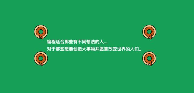
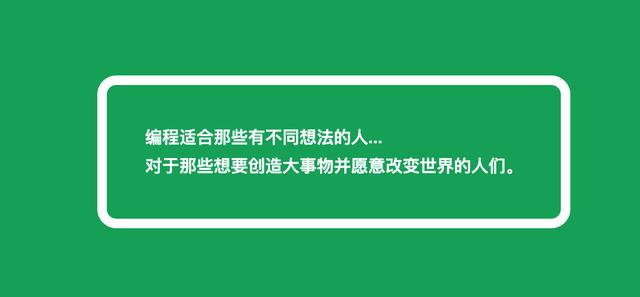
2. CSS圖像邊框
你是否曾經想象過你的元素周圍有甜甜圈?
現在,你無需過多的編碼即可通過純CSS添加它們。
為此,你需要在元素的CSS代碼中使用 border-image 屬性。
讓我們看一個例子,還是之前的HTML:
- <div id="box">
- 編程適合那些有不同想法的人... <br/>
- 對于那些想要創造大事物并愿意改變世界的人們。
- </div>
編寫CSS:
- #box {
- font-family: Arial;
- font-size: 18px;
- line-height: 30px;
- font-weight: bold;
- color: white;
- border: 40px solid transparent;
- border-image: url(https://image.flaticon.com/icons/svg/648/648787.svg);
- border-image-slice: 100%;
- border-image-width: 60px;
- padding: 15px;
- }
效果如下:
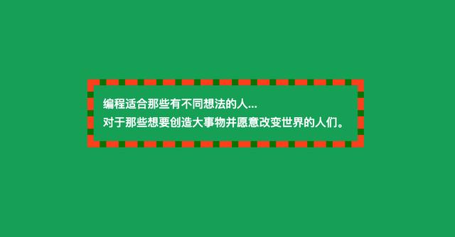
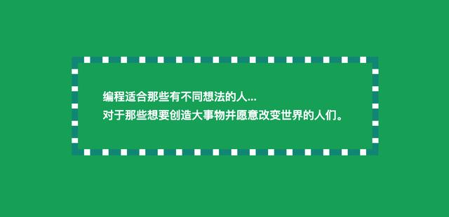
3. 蛇式CSS邊框
如果我們需要雙色超可視邊框怎么辦?
我們可以穿上蛇的衣服,想怎么著色就怎么著色。
- #box {
- font-family: Arial;
- font-size: 18px;
- line-height: 30px;
- font-weight: bold;
- color: white;
- padding: 15px;
- border: 10px dashed #FF5722;
- background:
- linear-gradient(to top, green, 10px, transparent 10px),
- linear-gradient(to right, green, 10px, transparent 10px),
- linear-gradient(to bottom, green, 10px, transparent 10px),
- linear-gradient(to left, green, 10px, transparent 10px);
- background-origin: border-box;
- }
效果如下:
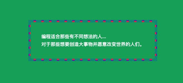
4. 階梯樣式CSS邊框
你是否曾經嘗試在div周圍添加3d樣式邊框?
在我們的元素中添加一些多色深度是非常容易的,我們只需要在CSS中添加一些方塊陰影就可以了。
讓我們測試一下我們的例子!
- #box {
- font-family: Arial;
- font-size: 18px;
- line-height: 30px;
- font-weight: bold;
- color: white;
- padding: 40px;
- box-shadow:
- inset #009688 0 0 0 5px,
- inset #059c8e 0 0 0 1px,
- inset #0cab9c 0 0 0 10px,
- inset #1fbdae 0 0 0 11px,
- inset #8ce9ff 0 0 0 16px,
- inset #48e4d6 0 0 0 17px,
- inset #e5f9f7 0 0 0 21px,
- inset #bfecf7 0 0 0 22px
- }
效果:
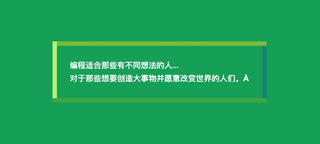
5. 只有陰影CSS邊框
有時我們需要在現成的設計中添加邊框,但添加更多像素會有些問題,它可能改變元素的位置。
現在,我們可以使用圍繞元素的框陰影作為邊框,看一下代碼。
- #box {
- font-family: Arial;
- font-size: 18px;
- line-height: 30px;
- font-weight: bold;
- color: white;
- padding: 40px;
- border-radius: 10px;
- box-shadow: 0 0 0 10px white;
- }
效果:
6. 帶陰影和輪廓的CSS邊框
我們可以通過幾種方式達到與蛇式類似的效果。接下來,其中之一是在元素CSS中混合 box-shadow 和 outline 屬性。
讓我們來看看。
- #box {
- font-family: Arial;
- font-size: 18px;
- line-height: 30px;
- font-weight: bold;
- color: white;
- padding: 40px;
- box-shadow: 0 0 0 10px white;
- outline: dashed 10px #009688;
- }
效果:
7. 少量陰影和輪廓
我們甚至可以在邊框中創建一些顏色和元素。
為此,我們需要混合陰影和輪廓,如下面的示例所示。
讓我們嘗試一下。
- #box {
- font-family: Arial;
- font-size: 18px;
- line-height: 30px;
- font-weight: bold;
- color: white;
- padding: 40px;
- box-shadow:
- 0 0 0 1px #009688,
- 0 0 0 5px #F44336,
- 0 0 0 9px #673AB7,
- 0 0 0 10px #009688;
- outline: dashed 10px #009688;
- }
效果:
8. 帶有陰影的雙CSS邊框
我們也可以混合一些 box-shadow 和 outline 的邊框。
這將創建一個漂亮的帶尖刺的線條效果,如下例所示。
讓我們檢查一下代碼!
- #box {
- font-family: Arial;
- font-size: 18px;
- line-height: 30px;
- font-weight: bold;
- color: white;
- padding: 40px;
- box-shadow: 0 0 0 10px #009688;
- border: 10px solid #009688;
- outline: dashed 10px white;
- }
效果:
9. 多色CSS邊框
如果我們想給邊框加上比前面的示例更多的顏色怎么辦?
我們甚至可以將元素的每一面都設置為不同的顏色。
為此,我們將需要一些帶有漸變的自定義背景。
看下面的例子。
- #box {
- font-family: Arial;
- font-size: 18px;
- line-height: 30px;
- font-weight: bold;
- color: white;
- padding: 40px;
- background:
- linear-gradient(to top, #4caf50, #4caf50 10px, transparent 10px),
- linear-gradient(to right, #c1ef8c, #c1ef8c 10px, transparent 10px),
- linear-gradient(to bottom, #8bc34a, #8bc34a 10px, transparent 10px),
- linear-gradient(to left, #009688, #009688 10px, transparent 10px);
- background-origin: border-box;
- }
效果:
結束
好了,這是最后一個點子,暫時先說到這里。
希望你喜歡,希望這幾個想法對你有用。
隨意對其進行測試,實驗,并在評論中顯示你發現使邊框有所不同的想法。