鴻蒙Tab切換選項卡同時更換內(nèi)容
51CTO和華為官方合作共建的鴻蒙技術(shù)社區(qū)
https://harmonyos.51cto.com/#zz
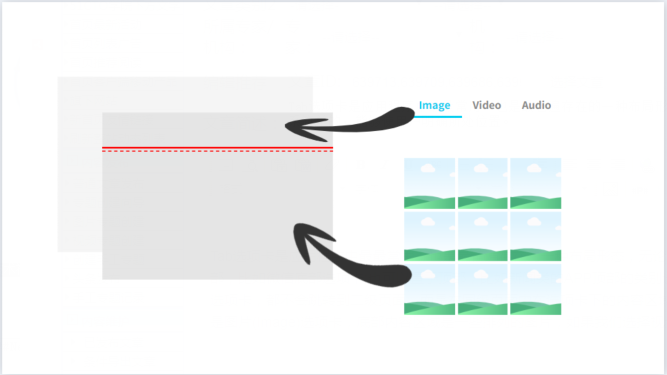
Tab選項卡是應(yīng)用程序中最最常用,也是最普遍存在的一種布局形態(tài),無論是在PC端還是在移動端,都是一種清晰明了,層級關(guān)系簡單的,能夠使用戶明確所處位置。Tab選項卡可以置于頁面的底部,比如微信底部選項卡;也可以置于頂部,比如新聞類的APP頂部的類別選項;還可以置于左側(cè)或者右側(cè),一般常見的是后臺應(yīng)用左側(cè)的樹形導(dǎo)航欄。它們存在一個共同的特性,那就無論我點擊那個選項卡,都不會跳轉(zhuǎn)到二級頁面,而是在同級頁面中在選項卡下的內(nèi)容區(qū)域中去渲染當(dāng)前選中的選項卡內(nèi)容。比如下面的示例圖片中,我們有三個Tab,圖片、視頻以及音頻,首次加載時我們選中的是圖片(Image)選項卡,底部內(nèi)容區(qū)域是一些排列的圖片,如果我們選擇視頻(Video),那么底部的圖片將被移除,視頻列表頁將被載入。
1、首先修改ability_main.xml代碼,在布局中添加頂部選項卡列表。
- <?xml version="1.0" encoding="utf-8"?>
- <DirectionalLayout
- xmlns:ohos="http://schemas.huawei.com/res/ohos"
- ohos:height="match_parent"
- ohos:width="match_parent"
- ohos:background_element="#444444"
- ohos:orientation="vertical">
- <TabList
- ohos:id="$+id:tab_list"
- ohos:weight="1"
- ohos:top_margin="10vp"
- ohos:tab_margin="24vp"
- ohos:tab_length="140vp"
- ohos:text_size="20fp"
- ohos:height="36vp"
- ohos:width="match_parent"
- ohos:layout_alignment="center"
- ohos:orientation="horizontal"
- ohos:text_alignment="center"
- ohos:normal_text_color="#999999"
- ohos:selected_text_color="#FFFFFF"
- ohos:selected_tab_indicator_color="#FFFFFF"
- ohos:selected_tab_indicator_height="2vp"/>
- </DirectionalLayout>
2、在MainAbilitySlice中為TabList容器添加Tab選項卡。
- //列表項
- TabList tabList = (TabList) findComponentById(ResourceTable.Id_tab_list);
- TabList.Tab imageTab = tabList.new Tab(getContext());
- imageTab.setText("Image");
- tabList.addTab(imageTab, true);
- scrollView.addComponent(imageGrid);
- TabList.Tab videoTab = tabList.new Tab(getContext());
- videoTab.setText("Video");
- tabList.addTab(videoTab);
- TabList.Tab audioTab = tabList.new Tab(getContext());
- audioTab.setText("Audio");
- tabList.addTab(audioTab);
3、選項卡切換狀態(tài)需要監(jiān)聽選項卡的選中狀態(tài)。我們可以在監(jiān)聽事件中對選項卡的業(yè)務(wù)邏輯做處理,其提供給我們?nèi)N方法,一當(dāng)前選中的Tab,二取消選中的Tab,三再次選中當(dāng)前Tab。在這三個方法中,我們可以具體的實現(xiàn)業(yè)務(wù)邏輯,比如當(dāng)前選中的Tab被連續(xù)點擊時,我們可以刷新我們呈現(xiàn)的內(nèi)容。
- tabList.addTabSelectedListener(new TabList.TabSelectedListener() {
- @Override
- public void onSelected(TabList.Tab tab) {
- //TODO 具體業(yè)務(wù)邏輯代碼
- }
- @Override
- public void onUnselected(TabList.Tab tab) {
- //TODO 具體業(yè)務(wù)邏輯代碼
- }
- @Override
- public void onReselected(TabList.Tab tab) {
- //TODO 具體業(yè)務(wù)邏輯代碼
- }
- });
4、頂部選項卡我們已經(jīng)實現(xiàn)了,那么怎么去實現(xiàn)點擊后內(nèi)容的更改呢?這里就需要用到一個新的組件ScrollView,ScrollView是一種帶有滾動功能的組件。如果我們使用常規(guī)的布局組件,內(nèi)容超出范圍后,上下左右滾動是需要我們自己去重寫,而ScrollView組件只需要設(shè)置它的子組件方向即可。修改ability_main.xml代碼添加ScrollView組件。
- xmlns:ohos="http://schemas.huawei.com/res/ohos"
- ohos:height="match_parent"
- ohos:width="match_parent"
- ohos:background_element="#444444"
- ohos:orientation="vertical">
- ... />
- ohos:id="$+id:tab_content"
- ohos:height="match_parent"
- ohos:width="match_parent"
- ohos:padding="10vp"
- ohos:weight="9">
5、首先初始化兩個TableLayout組件,在其中添加多個子組件,用于顯示圖片列表和視頻列表(僅供參考學(xué)習(xí),未實現(xiàn)真正的圖片和視頻)。
- private void initVideoGrid() {
- videoGrid = new TableLayout(this);
- videoGrid.setWidth(MATCH_PARENT);
- videoGrid.setHeight(MATCH_CONTENT);
- videoGrid.setColumnCount(1);
- videoGrid.setRowCount(2);
- for (int i = 1; i < 4; i++) {
- Text text = new Text(this);
- text.setWidth(MATCH_PARENT);
- text.setHeight(800);
- text.setTextAlignment(TextAlignment.CENTER);
- text.setText("第" + i + "塊視頻");
- ShapeElement shapeElement = new ShapeElement();
- shapeElement.setCornerRadius(20);
- shapeElement.setRgbColor(new RgbColor(192,0,255));
- text.setBackground(shapeElement);
- text.setPadding(10,10,10,10);
- text.setMarginsTopAndBottom(10,10);
- text.setMarginsLeftAndRight(20,20);
- text.setTextSize(50);
- videoGrid.addComponent(text);
- }
- }
- private void initImageGrid() {
- imageGrid = new TableLayout(this);
- imageGrid.setWidth(MATCH_PARENT);
- imageGrid.setHeight(MATCH_CONTENT);
- imageGrid.setColumnCount(4);
- imageGrid.setRowCount(2);
- for (int i = 1; i <= 10; i++) {
- Text text = new Text(this);
- text.setWidth(400);
- text.setHeight(400);
- text.setTextAlignment(TextAlignment.CENTER);
- text.setText("第" + i + "塊圖片");
- ShapeElement shapeElement = new ShapeElement();
- shapeElement.setCornerRadius(20);
- shapeElement.setRgbColor(new RgbColor(0,192,255));
- text.setBackground(shapeElement);
- text.setPadding(10,10,10,10);
- text.setMarginsTopAndBottom(10,10);
- text.setMarginsLeftAndRight(20,20);
- text.setTextSize(50);
- imageGrid.addComponent(text);
- }
- }
6、 構(gòu)建好各自的Tab的內(nèi)容后,我們需要在選擇監(jiān)聽中去做顯示處理。選中圖片后,需要加載圖片列表,選中視頻后,需要加載視頻列表的同時移除圖片列表,不然會存在小問題,你也可以嘗試一下。看看出現(xiàn)了什么問題。
- tabList.addTabSelectedListener(new TabList.TabSelectedListener() {
- @Override
- public void onSelected(TabList.Tab tab) {
- if (tab.getPosition() == 0) {
- scrollView.addComponent(imageGrid);
- } else if (tab.getPosition() == 1) {
- scrollView.addComponent(videoGrid);
- } else {
- scrollView.addComponent(new DirectionalLayout(getContext()));
- }
- HiLog.info(label, "onSelected:" + tab.getPosition());
- }
- @Override
- public void onUnselected(TabList.Tab tab) {
- if (tab.getPosition() == 0) {
- scrollView.removeComponent(imageGrid);
- } else if (tab.getPosition() == 1) {
- scrollView.removeComponent(videoGrid);
- } else {
- scrollView.removeComponent(new DirectionalLayout(getContext()));
- }
- HiLog.info(label, "onUnselected:" + tab.getText());
- }
- @Override
- public void onReselected(TabList.Tab tab) {
- HiLog.info(label, "onReselected:" + tab.getText());
- }
- });
- }
在這里我是以Tab的序號去判斷選中后的操作,你也可以使用它的text屬性來判斷。到這里基本的功能已經(jīng)實現(xiàn)了,我們運行查看一下效果。
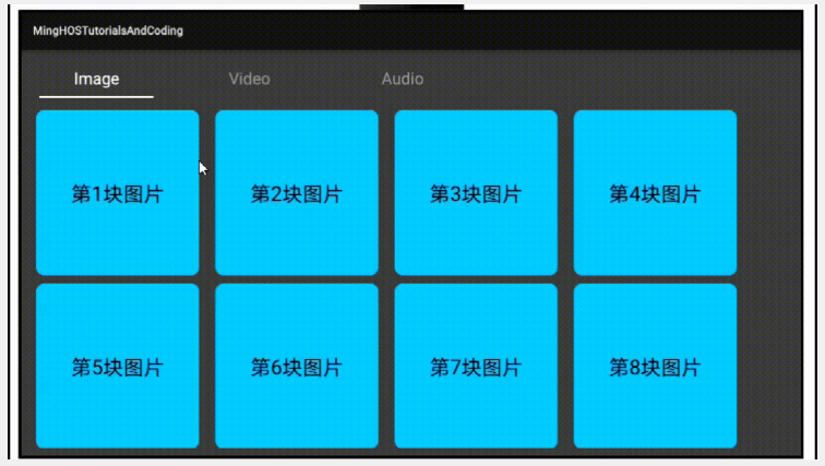
圖片中有個小Bug,你發(fā)現(xiàn)了嗎?應(yīng)該怎么解決這個問題呢?
©著作權(quán)歸作者和HarmonyOS技術(shù)社區(qū)共同所有,如需轉(zhuǎn)載,請注明出處,否則將追究法律責(zé)任。
51CTO和華為官方合作共建的鴻蒙技術(shù)社區(qū)
https://harmonyos.51cto.com/#zz