使用這 6個Vue加載動畫庫來減少我們網站的跳出率
阻止人們離開我們的網站的一種方法是添加視覺反饋,讓他們知道我們的網頁正在加載而不是壞了。視覺反饋還吸引了人們的注意力,因此等待時間似乎比靜態屏幕要短得多。
無論是添加微調動畫還是添加實際進度條,提供美觀的視覺元素都可以改善網站的性能,也會讓訪問者體驗更加的好。
對于Vue開發人員而言,有大量類似的庫供我們使用。
在本文中,分享 6 個我的最愛。
1. Vue Simple Spinner
github:https://dzwillia.github.io/vue-simple-spinner/examples/
顧名思義,這是一個非常簡單的組件,但功能仍然非常強大。Vue Simple Spinner提供了可定制加載樣式。使用 props,我們可以控制對應的樣式:
- Size
- Background and foreground colors
- Speed
- Label Text
- Much more…
安裝命令:
- npm install vue-simple-spinner --save.
然后,將其導入到組件中,在模板中進行聲明,然后更改所需的 props:
- <template>
- <vue-simple-spinner size="medium" />
- </template>
- <script>
- import VueSimpleSpinner from 'vue-simple-spinner'
- export default {
- components: {
- VueSimpleSpinner
- }
- }
效果如下:

2. Vue Radial Progress
github 地址:https://github.com/wyzantinc/vue-radial-progress
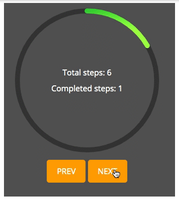
如果你想要的是一個真正的進度條而不是旋轉動畫,Vue Radial Progress 一個非常棒的庫。
Vue Radial Progress 可以在在進度欄中設置步驟數以及用戶當前所處的步驟。然后,根據完成的數量填充進度條的一定百分比。
具有平滑的動畫,可自定義的功能以及基于SVG的填充系統,當您具有包含多個離散步驟的異步過程時,此庫將非常強大。
安裝:
- npm install --save vue-radial-progress
此外,該庫使用組件插槽使圓內添加文本變得簡單
- <template>
- <radial-progress-bar :diameter="200"
- :completed-steps="completedSteps"
- :total-steps="totalSteps">
- <p>Total steps: {{ totalSteps }}</p>
- <p>Completed steps: {{ completedSteps }}</p>
- </radial-progress-bar>
- </template>
- <script>
- import RadialProgressBar from 'vue-radial-progress'
- export default {
- data () {
- return {
- completedSteps: 0,
- totalSteps: 10
- }
- },
- components: {
- RadialProgressBar
- }
- }
- </script>
3.Vue Loading Overlay
github: https://github.com/ankurk91/vue-loading-overlay
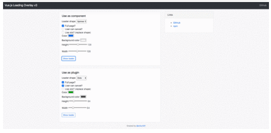
**Vue Loading Overlay **是全屏加載組件的理想解決方案。例如,如果應用程序包含某種儀表板,并且要等到所有數據加載完畢后再讓用戶四處點擊,則此庫很有用。
這個庫還有一個好用的特性就是加載時,用戶點擊遮罩,可以取消加載,并觸發一個事件,我們可以使用該事件取消正在運行的任何任務。
添加此功能,可以允許用戶自行決定任務何時花費太長時間來加載和退出。這意味著他們不必離開頁面。
安裝命令:
- npm install --save vue-loading-overlay
下面是 Loading Overlay library 使用示例:
- <template>
- <div class="vld-parent">
- <loading :active.sync="isLoading"
- :can-cancel="true"
- :on-cancel="onCancel"
- :is-full-page="fullPage"></loading>
- <label><input type="checkbox" v-model="fullPage">Full page?</label>
- <button @click.prevent="doAjax">fetch Data</button>
- </div>
- </template>
- <script>
- // Import component
- import Loading from 'vue-loading-overlay';
- // Import stylesheet
- import 'vue-loading-overlay/dist/vue-loading.css';
- export default {
- data() {
- return {
- isLoading: false,
- fullPage: true
- }
- },
- components: {
- Loading
- },
- methods: {
- doAjax() {
- this.isLoading = true;
- // simulate AJAX
- setTimeout(() => {
- this.isLoading = false
- },5000)
- },
- onCancel() {
- console.log('User cancelled the loader.')
- }
- }
- }
- </script>
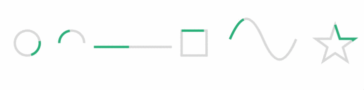
4. Vue Progress Path
github 地址:https://github.com/Akryum/vue-progress-path
Vue Progress Path 是最流行的加載庫之一。由 Vue Core團隊成員Guillaume Chau創建,這也是我最喜歡使用的工具之一。
使用 SVG,Vue Progress Path 會創建成形的進度條。它帶有幾個內置的形狀,但是最強大的功能是能夠傳遞我們自己的SVG形狀-這意味著無限的可能性。
使用npm i --save vue-progress-path將其添加到項目中,然后使用將該文件全局添加到src/main.js文件中。
- import 'vue-progress-path/dist/vue-progress-path.css'
- import VueProgress from 'vue-progress-path'
- Vue.use(VueProgress, {
- // defaultShape: 'circle',
- })
現在,來看看如何向組件添加進度 path 。
- <loading-progress
- :progress="progress"
- :indeterminate="indeterminate"
- :counter-clockwise="counterClockwise"
- :hide-background="hideBackground"
- shape="semicircle"
- size="64"
- />
這個庫還有一個很好地方,更改樣式無須通過 props ,直接使用CSS代碼來編輯樣式:
- .vue-progress-path path {
- stroke-width: 12;
- }
- .vue-progress-path .progress {
- stroke: red;
- }
5. Vue Loading Button
github 地址:https://github.com/shwilliam/vue-loading-button
Vue Loading Button 是一種簡單而有效的方式,可以向用戶顯示某些內容正在加載。
它所做的只是在按鈕被點擊時添加一個轉輪動畫。但有了平滑的動畫,它可以創建一個無縫的外觀,使網站流行。
安裝:
- npm install --save vue-loading-button
示例:
- <template>
- <VueLoadingButton aria-label='Send message' />
- </template>
- <script>
- import VueLoadingButton from 'vue-loading-button'
- export default {
- components: {
- VueLoadingButton,
- }
- }
- </script>

6. TB Skeleton
github 地址:https://github.com/anthinkingcoder/tb-skeleton
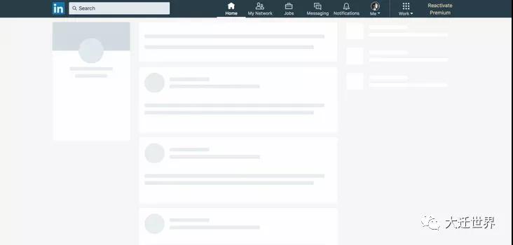
TBSkeleton 的體驗是非常好的。但是,這需要相當繁瑣的代碼,也要合理的規劃元素。
我認為理解這一點的最好方法就是寫個例子。
首先,使用npm install --save tb-skeleton安裝。然后,將下面內容添加到src/main.js文件中。
- import skeleton from 'tb-skeleton'
- import 'tb-skeleton/dist/skeleton.css'
- Vue.use(skeleton)
下面是 TBSkeleton 文檔中的骨架組件示例。
- <template>
- <div>
- <skeleton :theme="opacity" :shape="radius" :bg-color="#dcdbdc">
- <tb-skeleton width="30%" :aspect-ratio="1" :shape="circle" bg-color="#eee"></tb-skeleton>
- <tb-skeleton width="30%" :aspect-ratio=".3"></tb-skeleton>
- <tb-skeleton width="30%" :aspect-ratio=".3"></tb-skeleton>
- </skeleton>
- </div>
- </template>
- <script>
- import {TbSkeleton,Skeleton} from 'tb-skeleton'
- export default {
- components: {
- TbSkeleton,
- Skeleton
- }
- }
- </script>
如上所見,如果要使用這個庫,需要一些時間成本,但在一些需要用戶體驗極好的需求里,可以使用它。
~ 完,我是刷碗智,去刷碗咯了,下期見~
作者:Matt Maribojoc 譯者:前端小智 來源:stackabuse
原文:https://learnv.co/2020/02/6-vue-loader-animaon-libraries-to-reduce-your-bou
本文轉載自微信公眾號「大遷世界」,可以通過以下二維碼關注。轉載本文請聯系大遷世界公眾號。