前端:使用純css實現超實用的圖標庫(附源碼)
今天我們來復盤一下前端中css偽元素的知識以及如何用css偽元素來減輕javascript的壓力,做出一些腦洞大開的圖形。
預備知識
偽元素
偽元素是一個附加至選擇器末的關鍵詞,允許你對被選擇元素的特定部分修改樣式。偽元素主要有:
- ::first-letter 第一個字母的樣式
- ::first-line 首行文字的樣式
- ::before 元素頭部添加的修飾
- ::after 元素尾部添加的修飾
- ::placeholder input的占位符樣式
- ::selection 被選中元素的樣式
我個人覺得偽元素可以解釋為元素的修飾,可以為元素帶來額外的附加樣式,屬于額外的文檔結構。
偽類
用來表示無法在CSS中輕松或者可靠檢測到的某個元素的狀態或屬性,比如a標簽的hover表示鼠標經過的樣式,visited表示訪問過的鏈接的樣式,更多的用來描述元素狀態變化時的樣式,偽類主要有:
- :link
- :visited
- :hover
- :active
- :focus
- :lang(fr)
- :not(s)
- :root
- :first-child
- :last-child
- :only-child
- :nth-child(n)
- :nth-last-child(n)
- :first-of-type
- :last-of-type
- :only-of-type
- :nth-of-type(n)
- :nth-last-of-type(n)
- :empty
- :checked
- :enabled
- :disabled
- :target
我們利用css偽類和偽元素可以實現很多強大的視覺效果,這里我主要介紹偽元素,如果對偽類或其他css特性感興趣,可以看看我之前的css文章,寫的很全面。
正文
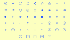
先看看我們用純css實現的圖標庫:

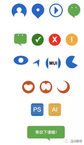
當然,如果我們知道了做出如上圖標的css原理,那么我們就可以實現更加豐富復雜的圖形,甚至可以打造自己的圖標庫。接下來我會介紹實現如上圖標的方式和方法,并給出部分源碼,方便大家學習。
原理
我們實現如上css圖標是基于偽元素的,可以利用偽元素的::before和::after和content屬性來為元素添加額外視覺效果,我們在上文中也介紹了偽元素的概念和類型,接下來讓我們來實現它吧~
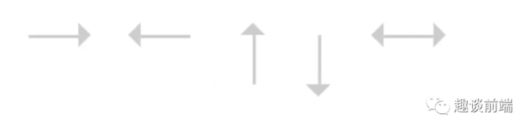
實現箭頭
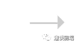
思路其實就是利用元素的::before偽元素畫一個三角形,用css設置span樣式為一條線并進行布局定位:
- // less
- .arrow {
- position: relative;
- display: inline-block;
- line-height: 0;
- background-color: #ccc;
- &.arrow-hor {
- width: 16px;
- height: 1px;
- }
- &.arrow-hor.right::before {
- content: '';
- position: absolute;
- top: -4px;
- right: -8px;
- border: 4px solid transparent;
- border-left: 4px solid #ccc;
- }
- }
- // html
- <span class="arrow arrow-hor right"></span>
這樣就實現了一個指向右的箭頭,我們用類似的方法也可以實現左箭頭,上下箭頭,實現雙向箭頭只需要加一個::after偽類并做適當定位就好了。
實現搜索圖標
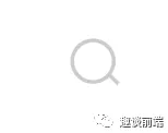
實現搜索圖標實際上只需要一個圓和一根線,然后我們會用transform:ratate來實現角度傾斜,具體實現如下:
- // less
- .search {
- position: relative;
- display: inline-block;
- width: 12px;
- height: 12px;
- border-radius: 50%;
- border: 1px solid #ccc;
- text-align: center;
- transform: rotate(-45deg);
- &::after {
- content: '';
- display: inline-block;
- width: 1px;
- height: 4px;
- background-color: #ccc;
- }
- }
- // html
- <span class="search"></span>
實現頭像

實現頭像我們要利用before和after偽元素,分別做人物頭部和身體,身體我們會用css畫一個橢圓來做:
- // less
- .dot-pan {
- position: relative;
- display: inline-flex;
- width: 60px;
- height: 60px;
- line-height: 0;
- align-items: center;
- border-radius: 50%;
- background-color: #06c;
- transform: rotate(-90deg);
- &::before {
- content: '';
- display: inline-block;
- width: 28px;
- height: 40px;
- margin-left: -3px;
- border-radius: 50% 50%;
- flex-shrink: 0;
- background-color: #fff;
- }
- &::after {
- content: '';
- display: inline-block;
- width: 20px;
- height: 20px;
- flex-shrink: 0;
- border-radius: 50%;
- background-color: #fff;
- }
- }
- // html
- <span class="search"></span>
實現地點圖標
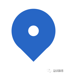
地點圖標由一個圓和一個三角形組成,如果要做的精致一點,我們可以再用一個偽元素來做一個定點:
- // less
- .locate-icon {
- position: relative;
- display: inline-block;
- width: 50px;
- height: 50px;
- border-radius: 50%;
- background-color: #06c;
- &::before {
- content: '';
- position: absolute;
- display: inline-block;
- width: 12px;
- height: 12px;
- border-radius: 50%;
- left: 50%;
- top: 50%;
- transform: translate(-50%, -50%);
- background-color: #fff;
- }
- &::after {
- content: '';
- margin-top: 45px;
- display: inline-block;
- border: 15px solid transparent;
- border-top-color: #06c;
- }
- }
- // html
- <span class="locate-icon mr-20"></span>
實現微信圖標

圖中2個眼睛主要是用到一個偽元素加上box-shadow來實現,這樣可以節約一個偽元素用來做小尾巴,至于如何實現不同形狀的三角形,如果有不懂的可以和我交流,具體實現如下:
- // less
- .wechat-icon {
- display: inline-block;
- width: 50px;
- height: 50px;
- border-radius: 50%;
- background-color: rgb(68, 170, 59);
- &::before {
- content: '';
- margin-top: 14px;
- position: absolute;
- width: 4px;
- height: 4px;
- border-radius: 50%;
- background-color: #fff;
- box-shadow: 16px 0 0 #fff;
- }
- &::after {
- content: '';
- margin-top: 42px;
- display: inline-block;
- border-width: 6px 10px 6px 10px;
- border-style: solid;
- border-color: transparent;
- border-top-color: rgb(68, 170, 59);
- transform: rotate(-147deg);
- }
- }
- // html
- <span class="wechat-icon mr-20"></span>
實現對勾圖標

這里也很簡單,我們用偽元素的content里放置一個勾號,然后設置顏色大小就好啦:
- // less
- .yes-icon {
- display: inline-flex;
- justify-content: center;
- align-items: center;
- width: 48px;
- height: 48px;
- background-color: green;
- border-radius: 50%;
- &::after {
- content: '✓';
- color: #fff;
- font-size: 30px;
- font-weight: bold;
- }
- }
- // html
- <span class="yes-icon mr-20"></span>
實現眼睛(一般用于網站訪問量圖標)
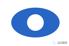
主要是做橢圓加上一個圓形的偽元素:
- .view-icon {
- display: inline-flex;
- justify-content: center;
- align-items: center;
- width: 58px;
- height: 36px;
- background-color: #06c;
- border-radius: 50%;
- &::after {
- content: '';
- display: inline-block;
- width: 20px;
- height: 20px;
- border-radius: 50%;
- background-color: #fff;
- }
- }
導航圖標

原理類似,主要思想是畫兩個三較形,用偽元素的三角形遮住主元素底部即可:
- .gps-icon {
- position: relative;
- display: inline-flex;
- justify-content: center;
- align-items: center;
- border-width: 30px 15px 30px 15px;
- border-color: transparent;
- border-style: solid;
- border-bottom-color: #06c;
- transform: translate(10px, -16px) rotate(32deg);
- &::after {
- position: absolute;
- bottom: -48px;
- content: '';
- display: inline-block;
- border-width: 10px 38px 30px 38px;
- border-color: transparent;
- border-style: solid;
- border-bottom-color: #fff;
- }
- }
實現心形圖標
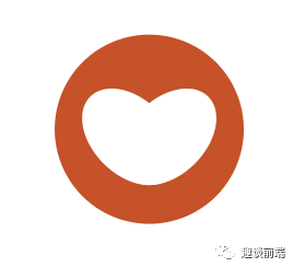
原理就是用兩個偽元素實現兩個橢圓,旋轉重合即可:
- .logo-x {
- position: relative;
- display: inline-flex;
- width: 50px;
- height: 50px;
- border-radius: 50%;
- background-color: rgb(212, 73, 17);
- &::after {
- position: absolute;
- content: '';
- left: 10px;
- top: 12px;
- display: inline-block;
- width: 20px;
- height: 30px;
- border-radius: 50%;
- background-color: #fff;
- transform: rotate(135deg);
- }
- &::before {
- position: absolute;
- content: '';
- right: 10px;
- top: 12px;
- display: inline-block;
- width: 20px;
- height: 30px;
- border-radius: 50%;
- background-color: #fff;
- transform: rotate(-135deg);
- }
- }
ps圖標
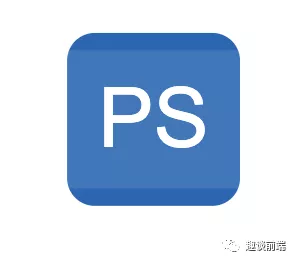
這個也是用偽元素,一個偽元素用來做文字圖形,一個用來做遮罩,來形成偽立體感:
- .logo-ps {
- position: relative;
- display: inline-flex;
- justify-content: center;
- align-items: center;
- width: 50px;
- height: 50px;
- border-radius: 8px;
- background-color: rgb(15, 102, 184);
- &::before {
- position: absolute;
- content: '';
- display: inline-block;
- width: 50px;
- height: 40px;
- background-color: rgba(255, 255, 255, .1);
- }
- &::after {
- position: absolute;
- content: 'PS';
- font-size: 24px;
- display: inline-block;
- color: #fff;
- }
- }
實現氣泡對話框
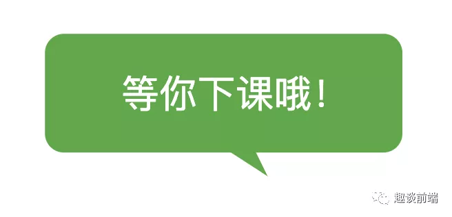
和微信圖標類似:
- .logo-pp {
- display: inline-block;
- width: 150px;
- height: 50px;
- border-radius: 8px;
- background-color: rgb(68, 170, 59);
- &::before {
- content: '等你下課哦!';
- margin-top: 14px;
- margin-left: -33px;
- position: absolute;
- color: #fff;
- }
- &::after {
- content: '';
- margin-top: 42px;
- display: inline-block;
- border-width: 6px 10px 6px 10px;
- border-style: solid;
- border-color: transparent;
- border-top-color: rgb(68, 170, 59);
- transform: rotate(-147deg) translate(-12px, 6px);
- }
- }
由于篇幅原因,其他的圖標就不一一實現了,原理都類似,筆者之前曾利用這個方案做過一套100個圖標的庫,成功應用于各個項目中,由于體積小不會造成額外請求,所以更加實用,但更復雜的圖形就為了方便還是建議用字體圖標或者svg,base64等。