ArkUI轉場動畫的使用—學習筆記
前言
好久不見,甚是想念!最近學業上有點小忙,擱置了一個半月,但我又回來啦!好好學習,天天向上(ง •_•)ง
最近看了官方文檔上“轉場動畫的使用(eTS)”的案例,也跟著學習了一下,順便做點筆記O(∩_∩)O
概述
效果圖如下:


正文
一.新建項目
DevEco Studio下載安裝成功后,打開DevEco Studio,點擊左上角的File,點擊New,再選擇New Project,選擇Empty Ability,然后點擊Next,給項目命名Animation,選擇設備類型Phone,選擇語言類型ets,API Version選擇7,最后點擊Finish
初始目錄的各個文件夾和文件的作用:
index.ets:用于描述UI布局、樣式、事件交互和頁面邏輯。
app.ets:用于全局應用邏輯和應用生命周期管理。
pages:用于存放所有組件頁面。
java:用于存放Ability等Java代碼。
resources:用于存放資源配置文件,比如:國際化字符串、資源限定相關資源和rawfile資源等。
二.構建主界面
從上面效果圖可以看出,主界面主要由5個相同樣式的功能菜單組成,我們可以將這些菜單抽取成一個子組件Item。
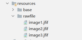
1.添加圖片
將所需要的圖片添加到resources > rawfile目錄下。
2.新建子組件
在index.ets中新建名為Item的子組件,聲明子組件Item的UI布局并添加樣式。創建Stack組件,包含圖片和文本,然后添加文本信息和頁面跳轉事件,定義變量text和uri。其中text用于給Text組件設置文本信息,uri用于設置頁面路由的地址。代碼如下:
- @Component
- struct Item {
- private text: string
- private uri: string
- build() {
- Stack({ alignContent: Alignment.Center }) {
- Image($rawfile('image1.jfif'))
- .objectFit(ImageFit.Cover)
- .width('100%')
- .height(100)
- .borderRadius(15)
- Text(this.text)
- .fontSize(20)
- .fontWeight(FontWeight.Bold)
- .fontColor(Color.Black)
- }
- .onClick(() => {
- router.push({ uri: this.uri })
- })
- .height(100)
- .borderRadius(15)
- .width('80%')
- .margin({ bottom: 20 })
- }
- }
3.將子組件添加到Index組件中
將Item組件添加到Index組件中,并給Item傳入參數text和uri,由于還未創建要跳轉的頁面,所以這里uri暫時傳空字符串。
- @Entry
- @Component
- struct Index {
- build() {
- Flex({ direction: FlexDirection.Column, alignItems: ItemAlign.Center, justifyContent: FlexAlign.Center }) {
- Item({ text: '頁面間轉場:底部滑入', uri: '' })
- Item({ text: '頁面間轉場:自定義1', uri: '' })
- Item({ text: '頁面間轉場:自定義2', uri: '' })
- Item({ text: '組件內轉場', uri: '' })
- Item({ text: '共享元素轉場', uri: '' })
- }
- .width('100%')
- .height('100%')
- .backgroundColor('#FFECECEC')
- }
- }
三.實現頁面間轉場
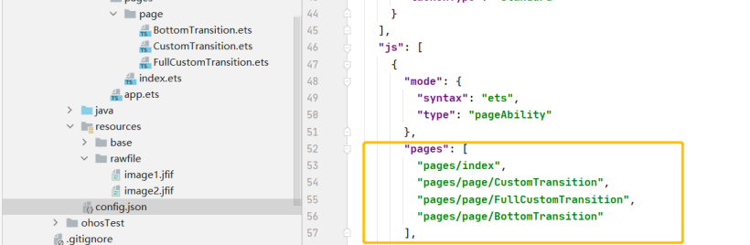
1.文件架構
在pages目錄下新建名為page的package,然后在page目錄下,點擊鼠標右鍵分別新建名為BottomTransition、CustomTransition和FullCustomTransition的三個ets文件。其中BottomTransition用于實現"頁面間轉場:底部滑入"動效;CustomTransition用于實現"頁面間轉場:自定義1"動效;FullCustomTransition用于實現"頁面間轉場:自定義2"動效。
新建后,打開config.json文件會看到pages標簽下自動添加了BottomTransition、CustomTransition和FullCustomTransition的路由地址,如果沒有的話就自己手動添加。
tips: 1.頁面文件名不能使用組件名稱,比如:Text.ets、Button.ets等。2.每個頁面文件中必須包含入口組件。3.pages列表中第一個頁面為應用的首頁入口。
2.實現頁面跳轉
在主界面index.ets的Index組件中,將BottomTransition、CustomTransition和FullCustomTransition的路由地址賦值給對應Item的uri。
- import router from '@system.router';
- @Entry
- @Component
- struct Index {
- build() {
- Flex({ direction: FlexDirection.Column, alignItems: ItemAlign.Center, justifyContent: FlexAlign.Center }) {
- Item({ text: '頁面間轉場:底部滑入', uri: 'pages/page/BottomTransition' })
- Item({ text: '頁面間轉場:自定義1', uri: 'pages/page/CustomTransition' })
- Item({ text: '頁面間轉場:自定義2', uri: 'pages/page/FullCustomTransition' })
- Item({ text: '組件內轉場', uri: '' })
- Item({ text: '共享元素轉場', uri: '' })
- }
- .width('100%')
- .height('100%')
- .backgroundColor('#FFECECEC')
- }
- }
3.實現"底部滑入"動效
在BottomTransition申明pageTransition方法配置轉場參數,其中PageTransitionEnter用于自定義當前頁面的入場效果,PageTransitionExit用于自定義當前頁面的退場效果。在這里我們設置PageTransitionEnter和PageTransitionExit的slide屬性為SlideEffect.Bottom,來實現BottomTransition入場時從底部滑入,退場時從底部滑出。
- @Entry
- @Component
- struct BottomTransition{
- build() {
- Stack() {
- Image($rawfile('image2.jfif'))
- .objectFit(ImageFit.Cover)
- .width('100%')
- .height('100%')
- }
- .width('100%')
- .height('100%')
- }
- pageTransition() {
- PageTransitionEnter({ duration: 600, curve: Curve.Smooth })
- .slide(SlideEffect.Bottom)
- PageTransitionExit({ duration: 600, curve: Curve.Smooth })
- .slide(SlideEffect.Bottom)
- }
- }
效果如下:

4.實現"頁面轉場:自定義1"動效
在CustomTransition.ets的CustomTransition組件中添加Stack組件和Image組件,并且定義pageTransition方法。我實現的效果是進場淡入退場淡出。代碼如下:
- @Entry
- @Component
- struct CustomTransition{
- build() {
- Stack() {
- Image($rawfile('image3.jfif'))
- .objectFit(ImageFit.Cover)
- .width('100%')
- .height('100%')
- }
- .width('100%')
- .height('100%')
- }
- pageTransition() {
- PageTransitionEnter({ duration: 1500, curve: Curve.Smooth })
- .opacity(0.2)
- PageTransitionExit({ duration:1000, curve: Curve.Smooth })
- .opacity(0)
- }
- }
效果如下:

5.實現"頁面轉場:自定義2"動效
實現的效果:頁面入場時淡入和放大,同時順時針旋轉;退場時淡出和縮小,同時逆時針旋轉。
在FullCustomTransition.ets的FullCustomTransition組件中添加Stack組件和Image組件,并且定義pageTransition方法。給Stack組件添加opacity、scale、rotate屬性,定義變量myProgress用來控制Stack組件的動效,在PageTransitionEnter和PageTransitionExit組件中動態改變myProgress的值。代碼如下:
- @Entry
- @Component
- struct FullCustomTransition{
- @State myProgress: number = 1
- build() {
- Stack() {
- Image($rawfile('image2.jfif'))
- .objectFit(ImageFit.Cover)
- .width('100%')
- .height('100%')
- }
- .width('100%')
- .height('100%')
- .opacity(this.myProgress)
- .scale({ x: this.myProgress, y: this.myProgress })
- .rotate({ x: 0, y: 0, z: 1, angle: 360 * this.myProgress })
- }
- pageTransition() {
- PageTransitionEnter({ duration: 1000, curve: Curve.Smooth })
- .onEnter((type: RouteType, progress: number) => {
- this.myProgress = progress
- })
- PageTransitionExit({ duration: 1000, curve: Curve.Smooth })
- .onExit((type: RouteType, progress: number) => {
- this.myProgress = 1 - progress
- })
- }
- }
效果如下:

四.實現組件內轉場
實現組件內轉場動效,通過一個按鈕來控制組件的添加和移除,呈現容器組件子組件添加和移除時的動效。組件轉場主要通過transition屬性方法配置轉場參數,在組件添加和移除時會執行過渡動效,需要配合animteTo才能生效。動效時長、曲線、延時跟隨animateTo中的配置。
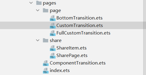
1.新建文件
在pages目錄下,新建名為ComponentTransition的ets文件
2.新建子組件
在ComponentTransition.ets文件中,新建ComponentItem子組件,添加Stack組件和Image組件。給Stack添加兩個transition屬性,分別用于定義組件的添加動效和移除動效。
- @Component
- struct ComponentItem {
- build() {
- Stack({ alignContent: Alignment.Center }) {
- Image($rawfile('image1.jfif'))
- .objectFit(ImageFit.Cover)
- .width('100%')
- .height(120)
- .borderRadius(15)
- }
- .height(120)
- .borderRadius(15)
- .width('80%')
- .margin({ top: 20 })
- .transition({ type: TransitionType.Insert, scale: { x: 0.5, y: 0.5 }, opacity: 0 })
- .transition({ type: TransitionType.Delete, rotate: { x: 0, y: 1, z: 0, angle: 360 }, scale: { x: 0, y: 0 } })
- }
- }
3.添加子組件
在ComponentTransition組件定義一個變量,用于控制ComponentItem的添加和移除,在Button組件的onClick事件中添加animateTo方法,來使ComponentItem子組件動效生效。
- @Entry
- @Component
- struct ComponentTransition {
- @State private isShow: boolean= false
- build() {
- Column() {
- if (this.isShow) {
- ComponentItem()
- }
- ComponentItem()
- Button("Toggle")
- .onClick(() => {
- animateTo({ duration: 600 }, () => {
- this.isShow = !this.isShow;
- })
- })
- .height(45)
- .width(200)
- .fontColor(Color.Black)
- .backgroundColor('rgb(203,155,192)')
- .margin({ top: 20 })
- }
- .padding({ left: 20, right: 20 })
- .backgroundColor('#FFECECEC')
- .height('100%')
- .width('100%')
- }
- }
效果圖如下:

五.實現元素共享轉場
共享元素轉場通過給組件設置sharedTransition屬性來實現,兩個頁面的組件配置為同一個id,則轉場過程中會執行共享元素轉場。sharedTransition可以設置動效的時長、動畫曲線和延時。
1.首先在pages目錄下新建名為share的包,然后在share目錄下分別新建名為ShareItem和SharePage的ets文件。其中ShareItem.ets用于展示小圖,SharePage.ets用于展示大圖。
2.在ShareItem.ets中給Image組件設置sharedTransition屬性,組件轉場id設置為"imageId"。
- import router from '@system.router'
- @Entry
- @Component
- struct ShareItem{
- build() {
- Flex() {
- Flex({ justifyContent: FlexAlign.Start, alignItems: ItemAlign.Center }) {
- Stack() {
- Image($rawfile('image3.jfif'))
- // 設置共享元素轉場屬性
- .sharedTransition('imageId', { duration: 600, curve: Curve.Smooth, delay: 100 })
- .onClick(() => {
- router.push({ uri: 'pages/share/SharePage' })
- })
- .objectFit(ImageFit.Cover)
- .height('100%')
- .width('100%')
- .borderRadius(15)
- }
- .height('100%')
- .width('100%')
- Text('點擊查看共享元素轉場動效')
- .fontSize(20)
- .fontColor(Color.Black)
- .fontWeight(FontWeight.Regular)
- .margin({ left: 10, right: 10 })
- }
- .height(120)
- .backgroundColor('rgb(181,222,224)')
- .borderRadius(15)
- .margin({ top: 20 })
- }
- .width('100%')
- .padding({ left: 16, right: 16 })
- .backgroundColor('#FFECECEC')
- }
- }
3.在SharePage.ets中給Image組件設置sharedTransition屬性,組件轉場id設置為"imageId"。
- @Entry
- @Component
- struct SharePage{
- build() {
- Stack() {
- Image($rawfile('image3.jfif'))
- // 設置共享元素轉場屬性
- .sharedTransition('imageId', { duration: 1000, curve: Curve.Smooth, delay: 100 })
- .objectFit(ImageFit.Cover)
- .width('100%')
- .height('100%')
- }
- .width('100%')
- .height('100%')
- }
- }
4.最后別忘在主界面添加相應路由地址。
- import router from '@system.router';
- @Entry
- @Component
- struct Index {
- build() {
- Flex({ direction: FlexDirection.Column, alignItems: ItemAlign.Center, justifyContent: FlexAlign.Center }) {
- Item({ text: '頁面間轉場:底部滑入', uri: 'pages/page/BottomTransition' })
- Item({ text: '頁面間轉場:自定義1', uri: 'pages/page/CustomTransition' })
- Item({ text: '頁面間轉場:自定義2', uri: 'pages/page/FullCustomTransition' })
- Item({ text: '組件內轉場', uri: 'pages/ComponentTransition' })
- Item({ text: '共享元素轉場', uri: 'pages/share/ShareItem' })
- }
- .width('100%')
- .height('100%')
- .backgroundColor('#FFECECEC')
- }
- }
效果圖如下:

tips:1.兩個頁面的組件配置為同一個id,則轉場過程中會執行共享元素轉場,配置為空字符串時不會有共享元素轉場效果。
2.在 config.json文件里在 “launchType”: "standard"后面添加以下代碼就能去掉左上角的標簽欄。
- "icon": "$media:icon",
- "description": "$string:mainability_description",
- "label": "$string:entry_MainAbility",
- "type": "page",
- "launchType": "standard",
- "metaData": {
- "customizeData": [
- {
- "name": "hwc-theme",
- "value": "androidhwext:style/Theme.Emui.Light.NoTitleBar",
- "extra": ""
- }
- ]
- }
結語
以上就是我這次的小分享啦❀❀!
文章相關附件可以點擊下面的原文鏈接前往下載
https://harmonyos.51cto.com/resource/1600