??想了解更多關于開源的內容,請訪問:??
??51CTO 開源基礎軟件社區??
??https://ost.51cto.com??
前言
經過重重的改造封裝,這一版的FilerBall組件基本達到了輔助開發的效果
繼上一篇文章,組件的基本功能完成了,但它的實用性和簡潔性還可以有很大的提高。
為了讓它變成一款可用性強的開發輔助組件,我決定從UI交互下手,將其打造成懸浮動態窗口,并封裝成組件接口 FilerBall。
上一篇介紹了文件管理接口的使用,這篇就以它為案例,簡單介紹如何發揮ArkUI框架在前端獨特的優勢,包括UI交互動畫、組件自適應能力、自定義組件封裝等,經驗值滿滿!
上文鏈接:https://ost.51cto.com/posts/21308。
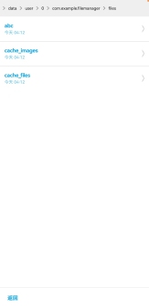
先上效果圖:組件懸浮小窗。
懸浮小球!-開源基礎軟件社區")
??點擊跳轉文末查看效果圖GIF??。
交互設計
組件UI整體設計:
- 頂部可滑動橫幅:展示當前訪問的路徑。
滑動效果使用Scroll組件。
Row() {
  Scroll() {
    Row() {
      ForEach(this.pathArray, (item, index) => {
        Text('>').fontColor('#ff888888').margin(7).scale({ y: 2 }).height('100%')
        Text(item).height('100%').maxLines(1).margin({ right: index === (this.pathArray.length - 1) ? 7 : 0 })
      }, item => item)

    }.height('100%').justifyContent(FlexAlign.Start)
  }.scrollable(ScrollDirection.Horizontal)
}.width('100%').height(40).backgroundColor('#ffeeeeee')- 中間主體:展示該層級的文件,文件夾目錄可進入下一級。
Scroller(){
  if(數組不為空){
    ForEach(this.curNodes,(item,index)=>{
      ......
    },item=>item.id)
  }else ......
}- 底部返回按鍵:返回上一級文件。
- “進入箭頭”實現:由于屬于三方組件,不方便用icon圖片,因此用“>”符號經過 ??圖形變換?? 來代替。
Text(item.fileType === 0 ? '>' : '')
  .scale({ y: 4 })
  .height('60%')
  .fontColor('#ccc')
  .margin({ right: '3%' })
屬性 | |
scale | 可以分別設置X軸、Y軸、Z軸的縮放比例,默認值為1,同時可以通過centerX和centerY設置縮放的中心點。 |
自適應布局:
ArkUI自身具有自適應的能力,我們則需要用對屬性方法和遵循某些規律就可實現組件自適應布局
本組件中基本使用Column和Row容器組件實現布局,例如:
- 頂部和底部高度固定,中間主體的高度彈性伸縮。
- 單個文件UI,內容信息左對齊,箭頭右對齊,寬度采用百分比設置。
豎屏
橫屏
懸浮窗改造!
在不修改原代碼的基礎上,利用自身的自適應性,額外封裝一層組件: 原組件Filer ==> 懸浮球動態擴展組件FilerBall 。
FilerBall 調用示例:
父組件及接口基本屬性設置:
import { FilerBall } from '../views/filemanager';
......
Column() {
  FilerBall({
    positionX: 0,
    positionY: 0,
    ballSize: 60
  })
}
.position({ x: 0, y: 0 }) // 因為呈現懸浮態,所以要設置初始絕對坐標,對應positionX、positionY參數,用于懸浮球拖動效果(必需)
.zIndex(1) // 置于窗口最上層(必需)
.width(300) // 寬高可設置在父組件,也可傳入FilerBall參數Width、Height
.height(500)
參數 | 描述 | 必填 | ETS類型 |
positionX | 懸浮球初始屏幕定位 X | 是,需與父組件一致 | number |
positionY | 懸浮球初始屏幕定位 Y | 是,需與父組件一致 | number |
ballSize | 懸浮球大小 | 是 | Length |
Height | Filer組件高度 | 否,默認 100% | Length |
Width | Filer組件高度 | 否,默認 100% | Length |
代碼實現:
封裝FilerBall的代碼主要是這幾點:
- 拖動效果
下面是實現拖動效果的代碼:
@State gx: number = 0
  @State gy: number = 0
  @Prop positionX: number // FilerBall 組件的傳參
  @Prop positionY: number // FilerBall 組件的傳參
  private px = 0
  private py = 0
Column() {
  .onTouch(event => {
    if (event.type === TouchType.Move) {
      this.gx = event.touches[0].screenX - this.px - this.positionX
      this.gy = event.touches[0].screenY - this.py - this.positionY
    }
    else if (event.type === TouchType.Down) {
      this.px = event.touches[0].x
      this.py = event.touches[0].y
    }
  })
}.position({ x: this.gx, y: this.gy }) // 要拖拽的組件
- 懸浮球與Filer組件的切換效果
- 使用ArkUI的條件渲染來切換懸浮球和Filer組件的UI。
- 給Filer添加加上像手機應用小窗頂部的橫條組件,用于按住拖拽、點擊切換懸浮球態。
- 為切換添加顯示動畫(文檔傳送門:??顯示動畫?? )
Filer封裝操作橫條。
Column() {
  Column() { // Filer頂部的操作橫條
   Line()
      .width('60%')
      .height(6)
    .backgroundColor('#ff868686')
  }
  .width('100%')
  .height(20)
  .justifyContent(FlexAlign.Center)
  .onClick() // 點擊切換成懸浮球態
  .onTouch() // 拖拽代碼
  Column() {
   Filer() // Filer組件
  }
}
.position({ x: this.gx, y: this.gy }) // 拖拽效果相關變量
顯示動畫。
@State @Watch('onBallStateChange') ballState: boolean = true
onBallStateChange() {
  if (this.ballState === false)
    animateTo({ duration: 300, curve: Curve.LinearOutSlowIn }, () => { // 顯示動畫,為打開賦予動畫
      this.tempW = '100%'
      this.tempH = '100%'
    })
  else {
    this.tempW = '0%'
    this.tempH = '0%'
  }
}
最終效果圖GIF
懸浮小球!-開源基礎軟件社區")
END
構想源于實踐,實踐啟發構想。在開發當中偶然的想法一步步凝聚了現實,編寫FilerBall組件的過程學到了很多經驗。它仍具有很高的擴展性和創造性,作為一個簡單的開發輔助工具組件,可能實現的不是很好,但也許日后的某次開發中我會需要它,正好接下來也學習學習怎么封裝成第三方庫。
(源代碼在文章的資源附件FilerBall.md中,是在 ???https://ost.51cto.com/posts/21308?? 附件代碼基礎上封裝的,測試用的Demo工程壓縮包也一起上傳了)。
文章相關附件可以點擊下面的原文鏈接前往下載
https://ost.51cto.com/resource/2543。
??想了解更多關于開源的內容,請訪問:??
??51CTO 開源基礎軟件社區??
??https://ost.51cto.com??