5種使用Python代碼輕松實(shí)現(xiàn)數(shù)據(jù)可視化的方法
數(shù)據(jù)可視化是數(shù)據(jù)科學(xué)家工作中的重要組成部分。在項(xiàng)目的早期階段,你通常會(huì)進(jìn)行探索性數(shù)據(jù)分析(Exploratory Data Analysis,EDA)以獲取對(duì)數(shù)據(jù)的一些理解。創(chuàng)建可視化方法確實(shí)有助于使事情變得更加清晰易懂,特別是對(duì)于大型、高維數(shù)據(jù)集。在項(xiàng)目結(jié)束時(shí),以清晰、簡(jiǎn)潔和引人注目的方式展現(xiàn)最終結(jié)果是非常重要的,因?yàn)槟愕氖鼙娡欠羌夹g(shù)型客戶,只有這樣他們才可以理解。
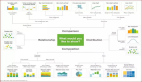
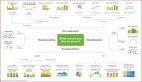
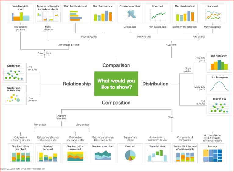
Matplotlib 是一個(gè)流行的 Python 庫,可以用來很簡(jiǎn)單地創(chuàng)建數(shù)據(jù)可視化方案。但每次創(chuàng)建新項(xiàng)目時(shí),設(shè)置數(shù)據(jù)、參數(shù)、圖形和排版都會(huì)變得非常繁瑣和麻煩。在這篇博文中,我們將著眼于 5 個(gè)數(shù)據(jù)可視化方法,并使用 Python Matplotlib 為他們編寫一些快速簡(jiǎn)單的函數(shù)。與此同時(shí),這里有一個(gè)很棒的圖表,可用于在工作中選擇正確的可視化方法!
散點(diǎn)圖
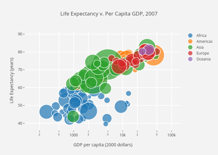
散點(diǎn)圖非常適合展示兩個(gè)變量之間的關(guān)系,因?yàn)槟憧梢灾苯涌吹綌?shù)據(jù)的原始分布。 如下面***張圖所示的,你還可以通過對(duì)組進(jìn)行簡(jiǎn)單地顏色編碼來查看不同組數(shù)據(jù)的關(guān)系。想要可視化三個(gè)變量之間的關(guān)系? 沒問題! 僅需使用另一個(gè)參數(shù)(如點(diǎn)大小)就可以對(duì)第三個(gè)變量進(jìn)行編碼,如下面的第二張圖所示。
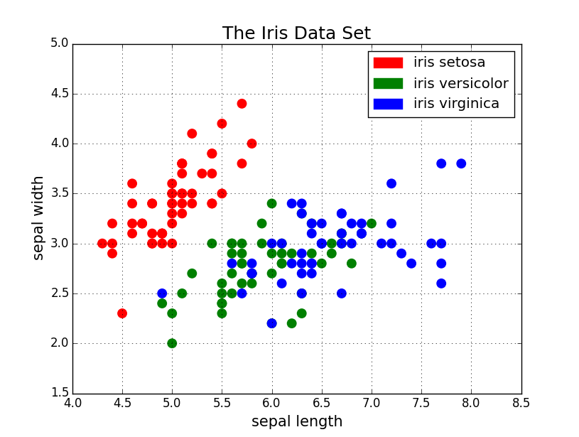
現(xiàn)在開始討論代碼。我們首先用別名 “plt” 導(dǎo)入 Matplotlib 的 pyplot 。要?jiǎng)?chuàng)建一個(gè)新的點(diǎn)陣圖,我們可調(diào)用 plt.subplots() 。我們將 x 軸和 y 軸數(shù)據(jù)傳遞給該函數(shù),然后將這些數(shù)據(jù)傳遞給 ax.scatter() 以繪制散點(diǎn)圖。我們還可以設(shè)置點(diǎn)的大小、點(diǎn)顏色和 alpha 透明度。你甚至可以設(shè)置 Y 軸為對(duì)數(shù)刻度。標(biāo)題和坐標(biāo)軸上的標(biāo)簽可以專門為該圖設(shè)置。這是一個(gè)易于使用的函數(shù),可用于從頭到尾創(chuàng)建散點(diǎn)圖!
- import matplotlib.pyplot as pltimport numpy as npdef scatterplot(x_data, y_data, x_label="", y_label="", title="", color = "r", yscale_log=False):
- # Create the plot object
- _, ax = plt.subplots() # Plot the data, set the size (s), color and transparency (alpha)
- # of the points
- ax.scatter(x_data, y_data, s = 10, color = color, alpha = 0.75) if yscale_log == True:
- ax.set_yscale('log') # Label the axes and provide a title
- ax.set_title(title)
- ax.set_xlabel(x_label)
- ax.set_ylabel(y_label)
折線圖
當(dāng)你可以看到一個(gè)變量隨著另一個(gè)變量明顯變化的時(shí)候,比如說它們有一個(gè)大的協(xié)方差,那***使用折線圖。讓我們看一下下面這張圖。我們可以清晰地看到對(duì)于所有的主線隨著時(shí)間都有大量的變化。使用散點(diǎn)繪制這些將會(huì)極其混亂,難以真正明白和看到發(fā)生了什么。折線圖對(duì)于這種情況則非常好,因?yàn)樗鼈兓旧咸峁┙o我們兩個(gè)變量(百分比和時(shí)間)的協(xié)方差的快速總結(jié)。另外,我們也可以通過彩色編碼進(jìn)行分組。
這里是折線圖的代碼。它和上面的散點(diǎn)圖很相似,只是在一些變量上有小的變化。
- def lineplot(x_data, y_data, x_label="", y_label="", title=""):
- # Create the plot object
- _, ax = plt.subplots() # Plot the best fit line, set the linewidth (lw), color and
- # transparency (alpha) of the line
- ax.plot(x_data, y_data, lw = 2, color = '#539caf', alpha = 1) # Label the axes and provide a title
- ax.set_title(title)
- ax.set_xlabel(x_label)
- ax.set_ylabel(y_label)
直方圖
直方圖對(duì)于查看(或真正地探索)數(shù)據(jù)點(diǎn)的分布是很有用的。查看下面我們以頻率和 IQ 做的直方圖。我們可以清楚地看到朝中間聚集,并且能看到中位數(shù)是多少。我們也可以看到它呈正態(tài)分布。使用直方圖真得能清晰地呈現(xiàn)出各個(gè)組的頻率之間的相對(duì)差別。組的使用(離散化)真正地幫助我們看到了“更加宏觀的圖形”,然而當(dāng)我們使用所有沒有離散組的數(shù)據(jù)點(diǎn)時(shí),將對(duì)可視化可能造成許多干擾,使得看清真正發(fā)生了什么變得困難。
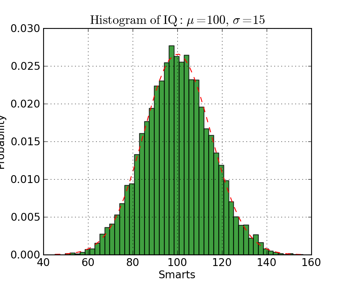
下面是在 Matplotlib 中的直方圖代碼。有兩個(gè)參數(shù)需要注意一下:首先,參數(shù) n_bins 控制我們想要在直方圖中有多少個(gè)離散的組。更多的組將給我們提供更加完善的信息,但是也許也會(huì)引進(jìn)干擾,使得我們遠(yuǎn)離全局;另一方面,較少的組給我們一種更多的是“鳥瞰圖”和沒有更多細(xì)節(jié)的全局圖。其次,參數(shù) cumulative 是一個(gè)布爾值,允許我們選擇直方圖是否為累加的,基本上就是選擇是 PDF(Probability Density Function,概率密度函數(shù))還是 CDF(Cumulative Density Function,累積密度函數(shù))。
- def histogram(data, n_bins, cumulative=False, x_label = "", y_label = "", title = ""):
- _, ax = plt.subplots()
- ax.hist(data, n_bins = n_bins, cumulative = cumulative, color = '#539caf')
- ax.set_ylabel(y_label)
- ax.set_xlabel(x_label)
- ax.set_title(title)
想象一下我們想要比較數(shù)據(jù)中兩個(gè)變量的分布。有人可能會(huì)想你必須制作兩張直方圖,并且把它們并排放在一起進(jìn)行比較。然而,實(shí)際上有一種更好的辦法:我們可以使用不同的透明度對(duì)直方圖進(jìn)行疊加覆蓋。看下圖,均勻分布的透明度設(shè)置為 0.5 ,使得我們可以看到他背后的圖形。這樣我們就可以直接在同一張圖表里看到兩個(gè)分布。
對(duì)于重疊的直方圖,需要設(shè)置一些東西。首先,我們?cè)O(shè)置可同時(shí)容納不同分布的橫軸范圍。根據(jù)這個(gè)范圍和期望的組數(shù),我們可以真正地計(jì)算出每個(gè)組的寬度。***,我們?cè)谕粡垐D上繪制兩個(gè)直方圖,其中有一個(gè)稍微更透明一些。
- # Overlay 2 histograms to compare themdef overlaid_histogram(data1, data2, n_bins = 0, data1_name="", data1_color="#539caf", data2_name="", data2_color="#7663b0", x_label="", y_label="", title=""):
- # Set the bounds for the bins so that the two distributions are fairly compared
- max_nbins = 10
- data_range = [min(min(data1), min(data2)), max(max(data1), max(data2))]
- binwidth = (data_range[1] - data_range[0]) / max_nbins if n_bins == 0
- bins = np.arange(data_range[0], data_range[1] + binwidth, binwidth) else:
- bins = n_bins # Create the plot
- _, ax = plt.subplots()
- ax.hist(data1, bins = bins, color = data1_color, alpha = 1, label = data1_name)
- ax.hist(data2, bins = bins, color = data2_color, alpha = 0.75, label = data2_name)
- ax.set_ylabel(y_label)
- ax.set_xlabel(x_label)
- ax.set_title(title)
- ax.legend(loc = 'best')
柱狀圖
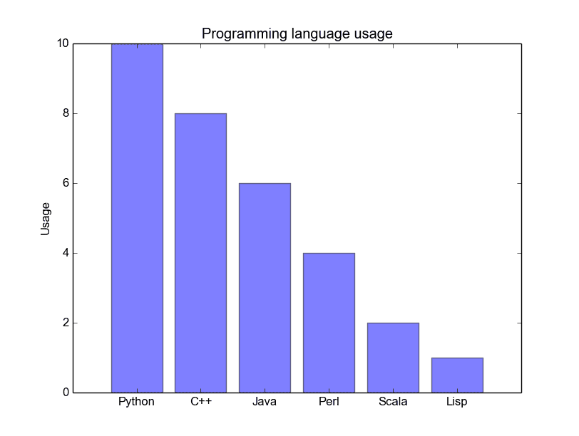
當(dāng)你試圖將類別很少(可能小于10)的分類數(shù)據(jù)可視化的時(shí)候,柱狀圖是最有效的。如果我們有太多的分類,那么這些柱狀圖就會(huì)非常雜亂,很難理解。柱狀圖對(duì)分類數(shù)據(jù)很好,因?yàn)槟憧梢院苋菀椎乜吹交谥念悇e之間的區(qū)別(比如大小);分類也很容易劃分和用顏色進(jìn)行編碼。我們將會(huì)看到三種不同類型的柱狀圖:常規(guī)的,分組的,堆疊的。在我們進(jìn)行的過程中,請(qǐng)查看圖形下面的代碼。
常規(guī)的柱狀圖如下面的圖1。在 barplot() 函數(shù)中,xdata 表示 x 軸上的標(biāo)記,ydata 表示 y 軸上的桿高度。誤差條是一條以每條柱為中心的額外的線,可以畫出標(biāo)準(zhǔn)偏差。
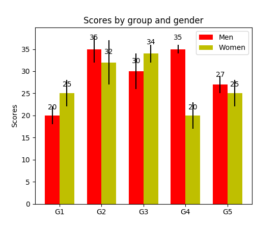
分組的柱狀圖讓我們可以比較多個(gè)分類變量。看看下面的圖2。我們比較的***個(gè)變量是不同組的分?jǐn)?shù)是如何變化的(組是G1,G2,……等等)。我們也在比較性別本身和顏色代碼。看一下代碼,y_data_list 變量實(shí)際上是一個(gè) y 元素為列表的列表,其中每個(gè)子列表代表一個(gè)不同的組。然后我們對(duì)每個(gè)組進(jìn)行循環(huán),對(duì)于每一個(gè)組,我們?cè)?x 軸上畫出每一個(gè)標(biāo)記;每個(gè)組都用彩色進(jìn)行編碼。
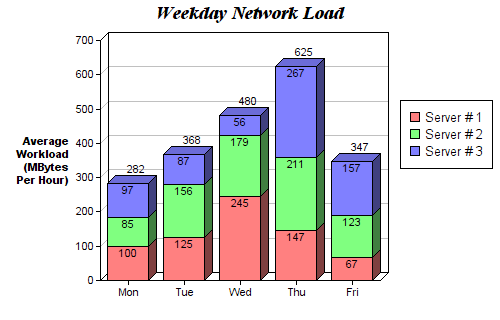
堆疊柱狀圖可以很好地觀察不同變量的分類。在圖3的堆疊柱狀圖中,我們比較了每天的服務(wù)器負(fù)載。通過顏色編碼后的堆棧圖,我們可以很容易地看到和理解哪些服務(wù)器每天工作最多,以及與其他服務(wù)器進(jìn)行比較負(fù)載情況如何。此代碼的代碼與分組的條形圖相同。我們循環(huán)遍歷每一組,但這次我們把新柱放在舊柱上,而不是放在它們的旁邊。
- def barplot(x_data, y_data, error_data, x_label="", y_label="", title=""):
- _, ax = plt.subplots()
- # Draw bars, position them in the center of the tick mark on the x-axis
- ax.bar(x_data, y_data, color = '#539caf', align = 'center')
- # Draw error bars to show standard deviation, set ls to 'none'
- # to remove line between points
- ax.errorbar(x_data, y_data, yerr = error_data, color = '#297083', ls = 'none', lw = 2, capthick = 2)
- ax.set_ylabel(y_label)
- ax.set_xlabel(x_label)
- ax.set_title(title)
- def stackedbarplot(x_data, y_data_list, colors, y_data_names="", x_label="", y_label="", title=""):
- _, ax = plt.subplots()
- # Draw bars, one category at a time
- for i in range(0, len(y_data_list)):
- if i == 0:
- ax.bar(x_data, y_data_list[i], color = colors[i], align = 'center', label = y_data_names[i])
- else:
- # For each category after the first, the bottom of the
- # bar will be the top of the last category
- ax.bar(x_data, y_data_list[i], color = colors[i], bottom = y_data_list[i - 1], align = 'center', label = y_data_names[i])
- ax.set_ylabel(y_label)
- ax.set_xlabel(x_label)
- ax.set_title(title)
- ax.legend(loc = 'upper right')
- def groupedbarplot(x_data, y_data_list, colors, y_data_names="", x_label="", y_label="", title=""):
- _, ax = plt.subplots()
- # Total width for all bars at one x location
- total_width = 0.8
- # Width of each individual bar
- ind_width = total_width / len(y_data_list)
- # This centers each cluster of bars about the x tick mark
- alteration = np.arange(-(total_width/2), total_width/2, ind_width)
- # Draw bars, one category at a time
- for i in range(0, len(y_data_list)):
- # Move the bar to the right on the x-axis so it doesn't
- # overlap with previously drawn ones
- ax.bar(x_data + alteration[i], y_data_list[i], color = colors[i], label = y_data_names[i], width = ind_width)
- ax.set_ylabel(y_label)
- ax.set_xlabel(x_label)
- ax.set_title(title)
- ax.legend(loc = 'upper right')
箱形圖
我們之前看了直方圖,它很好地可視化了變量的分布。但是如果我們需要更多的信息呢?也許我們想要更清晰的看到標(biāo)準(zhǔn)偏差?也許中值與均值有很大不同,我們有很多離群值?如果有這樣的偏移和許多值都集中在一邊呢?
這就是箱形圖所適合干的事情了。箱形圖給我們提供了上面所有的信息。實(shí)線框的底部和頂部總是***個(gè)和第三個(gè)四分位(比如 25% 和 75% 的數(shù)據(jù)),箱體中的橫線總是第二個(gè)四分位(中位數(shù))。像胡須一樣的線(虛線和結(jié)尾的條線)從這個(gè)箱體伸出,顯示數(shù)據(jù)的范圍。
由于每個(gè)組/變量的框圖都是分別繪制的,所以很容易設(shè)置。xdata 是一個(gè)組/變量的列表。Matplotlib 庫的 boxplot() 函數(shù)為 ydata 中的每一列或每一個(gè)向量繪制一個(gè)箱體。因此,xdata 中的每個(gè)值對(duì)應(yīng)于 ydata 中的一個(gè)列/向量。我們所要設(shè)置的就是箱體的美觀。

- def boxplot(x_data, y_data, base_color="#539caf", median_color="#297083", x_label="", y_label="", title=""):
- _, ax = plt.subplots()
- # Draw boxplots, specifying desired style
- ax.boxplot(y_data
- # patch_artist must be True to control box fill
- , patch_artist = True
- # Properties of median line
- , medianprops = {'color': median_color}
- # Properties of box
- , boxprops = {'color': base_color, 'facecolor': base_color}
- # Properties of whiskers
- , whiskerprops = {'color': base_color}
- # Properties of whisker caps
- , capprops = {'color': base_color})
- # By default, the tick label starts at 1 and increments by 1 for
- # each box drawn. This sets the labels to the ones we want
- ax.set_xticklabels(x_data)
- ax.set_ylabel(y_label)
- ax.set_xlabel(x_label)
- ax.set_title(title)
結(jié)語
使用 Matplotlib 有 5 個(gè)快速簡(jiǎn)單的數(shù)據(jù)可視化方法。將相關(guān)事務(wù)抽象成函數(shù)總是會(huì)使你的代碼更易于閱讀和使用!我希望你喜歡這篇文章,并且學(xué)到了一些新的有用的技巧。如果你確實(shí)如此,請(qǐng)隨時(shí)給它點(diǎn)贊。
Cheers!