前端精神小伙:React Hooks響應式布局
前言
現在稍微大型的站點都會采用H5/PC端 并行,通過nignx獲取瀏覽器的UA信息來切換站點。
但這對于一些企業站點或人手不足的小型項目來說,就很難實現。
通過CSS媒體查詢實現響應式布局,是主流方式。
但是,有時在 React 程序中,需要根據屏幕大小有條件地渲染不同的組件(寫媒體查詢太麻煩了,還不如另寫組件),其實使用React Hooks,可以更靈活實現。
本文的實現來自:
- Developing responsive layouts with React Hooks
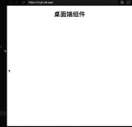
1. 方案一:innerWidth
一個很簡單粗略的方案,是個前端都知道:
- const MyComponent = () => {
- // 當前窗口寬度
- const width = window.innerWidth;
- // 鄰介值
- const breakpoint = 620;
- // 寬度小于620時渲染手機組件,反之桌面組件
- return width < breakpoint ? <MobileComponent /> : <DesktopComponent />;
- }
這個簡單的解決方案肯定會起作用。根據用戶設備的窗口寬度,我們可以呈現桌面視圖或手機視圖。
但是,當調整窗口大小時,未解決寬度值的更新問題,可能會渲染錯誤的組件。
2. 方案二:Hooks+resize
說著也簡單,監聽resize事件時,觸發useEffect改變數據。
- const MyComponent = () => {
- const [width, setWidth] = React.useState(window.innerWidth);
- const breakpoint = 620;
- React.useEffect(() => {
- window.addEventListener("resize", () => setWidth(window.innerWidth));
- }, []);
- return width < breakpoint ? <MobileComponent /> : <DesktopComponent />;
- }
但精通Hooks的你,一定知道這里存在內存性能消耗問題:resize事件沒移除!
優化版本:
- const useViewport = () => {
- const [width, setWidth] = React.useState(window.innerWidth);
- React.useEffect(() => {
- const handleWindowResize = () => setWidth(window.innerWidth);
- window.addEventListener("resize", handleWindowResize);
- return () => window.removeEventListener("resize", handleWindowResize);
- }, []);
- return { width };
- }
3. 方案三:構建useViewport
自定義React Hooks,可以將組件/函數最大程度的復用。構建一個也很簡單:
- const useViewport = () => {
- const [width, setWidth] = React.useState(window.innerWidth);
- React.useEffect(() => {
- const handleWindowResize = () => setWidth(window.innerWidth);
- window.addEventListener("resize", handleWindowResize);
- return () => window.removeEventListener("resize", handleWindowResize);
- }, []);
- return { width };
- }
精簡后的組件代碼:
- const MyComponent = () => {
- const { width } = useViewport();
- const breakpoint = 620;
- return width < breakpoint ? <MobileComponent /> : <DesktopComponent />;
- }
但是這里還有另一個性能問題:
響應式布局影響的是多個組件,如果在多處使用useViewport,這將浪費性能。

這時就需要另一個React親兒子:React Context(上下文) 來幫忙。
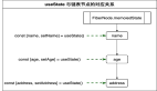
4.終極方案:Hooks+Context
我們將創建一個新的文件viewportContext,在其中可以存儲當前視口大小的狀態以及計算邏輯。
- const viewportContext = React.createContext({});
- const ViewportProvider = ({ children }) => {
- // 順帶監聽下高度,備用
- const [width, setWidth] = React.useState(window.innerWidth);
- const [height, setHeight] = React.useState(window.innerHeight);
- const handleWindowResize = () => {
- setWidth(window.innerWidth);
- setHeight(window.innerHeight);
- }
- React.useEffect(() => {
- window.addEventListener("resize", handleWindowResize);
- return () => window.removeEventListener("resize", handleWindowResize);
- }, []);
- return (
- <viewportContext.Provider value={{ width, height }}>
- {children}
- </viewportContext.Provider>
- );
- };
- const useViewport = () => {
- const { width, height } = React.useContext(viewportContext);
- return { width, height };
- }
緊接著,你需要在React根節點,確保已經包裹住了App:
- const App = () => {
- return (
- <ViewportProvider>
- <AppComponent />
- </ViewportProvider>
- );
- }
在往后的每次useViewport(),其實都只是共享Hooks。
- const MyComponent = () => {
- const { width } = useViewport();
- const breakpoint = 620;
- return width < breakpoint ? <MobileComponent /> : <DesktopComponent />;
- }
后記
github上面的響應式布局hooks,都是大同小異的實現方式。
本文除了介紹React Hooks的響應式布局實現,還介紹了如何自定義hooks與使用Context上下文,來復用,以達到性能最佳優化。