一篇帶給你ETS自定義導(dǎo)航欄組件
作者:木棉花潘穎琳
這次給大家?guī)淼氖荅TS自定義導(dǎo)航欄組件,以仿淘寶的導(dǎo)航欄為案例Demo來講解。

??想了解更多關(guān)于開源的內(nèi)容,請訪問:??
概述
效果圖如下:
當(dāng)被選中時,字體樣式和圖片都會相應(yīng)變化。
正文
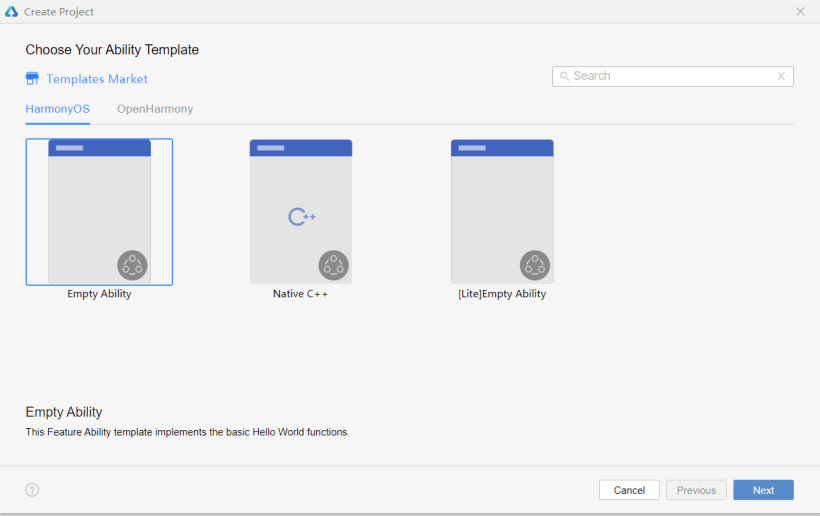
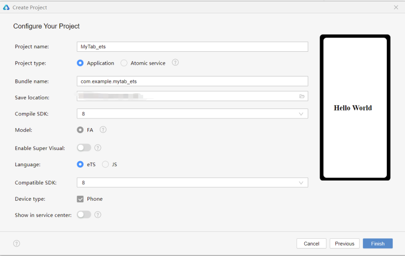
新建空項目
SDK選擇7以上,language選擇ets。
初始化導(dǎo)航欄
在media文件夾下存放所需的圖片,初始設(shè)置導(dǎo)航欄選中的頁簽index為0,同時定義一個靜態(tài)數(shù)組存放導(dǎo)航菜單的數(shù)據(jù)——標(biāo)題名稱、選中與未選中狀態(tài)的圖片。案例Demo代碼如下:
selectedIndex: number = 0
menuData: any[]= [{
"text": " 首頁 ",
"inActiveImg": $r('app.media.shouye'),
"activeImg": $r('app.media.taobao')
},
{
"text": " 逛逛 ",
"inActiveImg": $r('app.media.guangguang'),
"activeImg": $r('app.media.guangguang_on'),
},
{
"text": " 消息 ",
"inActiveImg": $r('app.media.msg'),
"activeImg": $r('app.media.msg_on'),
},
{
"text": "購物車",
"inActiveImg": $r('app.media.gouwuche'),
"activeImg": $r('app.media.gouwuche_on'),
},
{
"text": "我的淘寶",
"inActiveImg": $r('app.media.wode'),
"activeImg": $r('app.media.wode_on'),
},
]
布局樣式
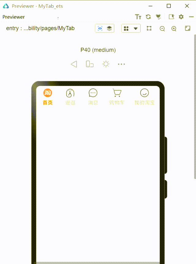
單個頁簽由圖片和文本組成,為縱向布局;整體導(dǎo)航欄為水平布局;利用ForEach循環(huán)遍歷導(dǎo)航菜單欄的數(shù)據(jù),并通過判斷是否選中來確定所顯示的圖片及文本樣式(邊框可根據(jù)喜好添加),案例代碼如下:
build() {
    Flex({ direction: FlexDirection.Row, alignItems: ItemAlign.Center, justifyContent: FlexAlign.SpaceAround }) {
      ForEach(this.menuData.map((item1, index1) => {
        return { i: index1, data: item1 };
      }),
        item => { // Parameter 2: item generator
            Column({ space: 5 }) {
              Image(this.selectedIndex === item.i ? item.data.activeImg : item.data.inActiveImg
              ).width(30).height(30).objectFit(ImageFit.Cover)

              Text(item.data.text)
                .fontSize(15)
                .fontWeight(FontWeight.Bold)
                .fontColor(this.selectedIndex === item.i ? '#FC7D0C' : '#bfbfbf')

            }.height('60').onClick(() => {
              this.selectedIndex = item.i;
            })
        }, item => item.i.toString()
      )
    }
    .borderColor(Color.Gray)
    .borderWidth(0.2)
    .width('100%')
    .height('9%')
  }
到此步,可預(yù)覽效果如下:
封裝使用
1、可以新建一個etsPage,將MyTab組件設(shè)置為export,然后在新頁面import來使用
將:
selectedIndex: number = 0
改為:
selectedIndex: number
這是為了雙向數(shù)據(jù)綁定:
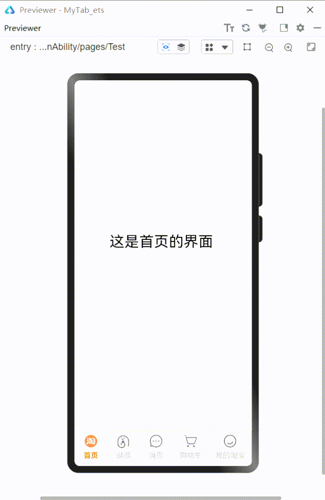
案例Demo新建的頁面Test.ets,代碼如下:
import { MyTab } from './MyTab'
struct Test {
selectedIndex: number = 0
build() {
Flex({ direction: FlexDirection.Column }) {
Flex({ direction: FlexDirection.Column }) {
if (this.selectedIndex == 0) {
Flex({ direction: FlexDirection.Column, alignItems: ItemAlign.Center, justifyContent: FlexAlign.Center }) {
Text('這是首頁的界面').fontSize(30)
}.height('92%').width('98%')
} else if (this.selectedIndex == 1) {
Flex({ direction: FlexDirection.Column, alignItems: ItemAlign.Center, justifyContent: FlexAlign.Center }) {
Text('這是逛逛的界面').fontSize(30)
}.height('92%').width('98%')
} else if (this.selectedIndex == 2) {
Flex({ direction: FlexDirection.Column, alignItems: ItemAlign.Center, justifyContent: FlexAlign.Center }) {
Text('這是消息界面').fontSize(30)
}.height('92%').width('98%')
} else if (this.selectedIndex == 3) {
Flex({ direction: FlexDirection.Column, alignItems: ItemAlign.Center, justifyContent: FlexAlign.Center }) {
Text('這是購物車的界面').fontSize(30)
}.height('92%').width('98%')
} else if (this.selectedIndex == 4) {
Flex({ direction: FlexDirection.Column, alignItems: ItemAlign.Center, justifyContent: FlexAlign.Center }) {
Text('這是我的界面').fontSize(30)
}.height('92%').width('98%')
}
}
.width('98%')
.height('91%')
MyTab({ selectedIndex: $selectedIndex })
}
.width('100%')
.height('100%')
}
}
2、也可以在同一Page將其作為子組件來使用
作為子組件來使用的話就直接將MyTab移至同一ets文件,無需添加export和import模塊,不過同樣需要將選中的索引selectedindex類型改為雙向數(shù)據(jù)綁定@Link。
結(jié)語
以上就是我這次的小分享啦!
文章相關(guān)附件可以點擊下面的原文鏈接前往下載:
https://ost.51cto.com/resource/2179。
責(zé)任編輯:jianghua
來源:
鴻蒙社區(qū)