React 實現給密碼輸入框加上【密碼強度】展示?
作者:林三心不學挖掘機
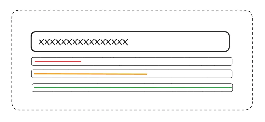
密碼設置的好不好,關乎到你的賬號安全性,越復雜的密碼越安全,那么密碼強度怎么計算呢? 且應該如何實現以下這樣的密碼強度動畫展示效果呢?
密碼強度
平時我們在瀏覽各種網站和 APP 的時候,都接觸過密碼這個東西~
密碼設置的好不好,關乎到你的賬號安全性,越復雜的密碼越安全,所以密碼強度很重要,而我們在做注冊功能的時候,也有責任去幫協助用戶設置一個高密碼強度的密碼~
那么密碼強度怎么計算呢? 且應該如何實現以下這樣的密碼強度動畫展示效果呢?

思路
其實思路很簡單:
(1) 監聽密碼輸入框的變化
(2) 密碼變化時,獲取密碼文本,并通過某種方式計算這個密碼的強度分數
(3) 根據強度分數,改變下方塊的顏色和寬度
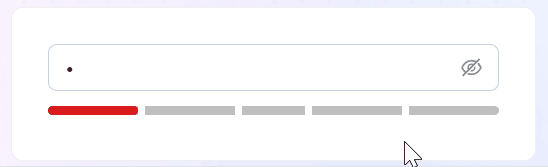
- 0分:強度低,紅色,寬度 20%
- 1分:強度低,紅色,寬度 40%
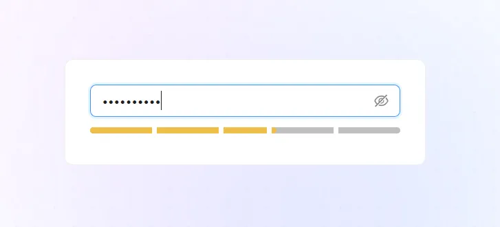
- 2分:強度中,橙色,寬度 60%
- 3分:強度高,綠色,寬度 80%
- 4分:強度高,綠色,寬度 100%
計算密碼強度分數
用什么方式去計算密碼強度方式呢?我們可以用 @zxcvbn-ts/core這個庫來計算~
@zxcvbn-ts/core 是 zxcvbn 密碼強度估計器的 TypeScript 實現版本,用于幫助開發者評估用戶設置密碼的復雜度和安全性,計算的依據有:
- 密碼長度: 越長分數越高
- 字符類型: 數字、字母、符號
- 詞典攻擊檢測: 內置詞典列表,檢測密碼強度
- 評分系統: 0-4分,分數越高越安全
- 熵計算: 評測密碼所需嘗試次數,熵越高,分數越高
pnpm i @zxcvbn-ts/core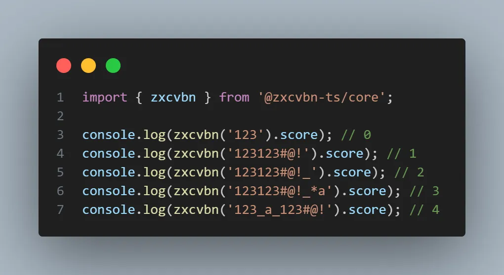
密碼強度動畫展示效果
計算了分數之后,我們需要根據分數去展示:
- 不同的顏色
- 不同的寬度
我們可以使用屬性選擇器的方式,去完成這一個效果,看以下代碼~
當密碼改變的時候,會實時計算密碼強度分數,這也就是意味著 data-score 這個屬性會一直變,接著我們可以在樣式中,去根據屬性選擇器去設置不同的顏色和寬度
現在可以看到這樣的效果

完善動畫效果
但是我們如果想實現分格的效果,可以借助偽元素去做~
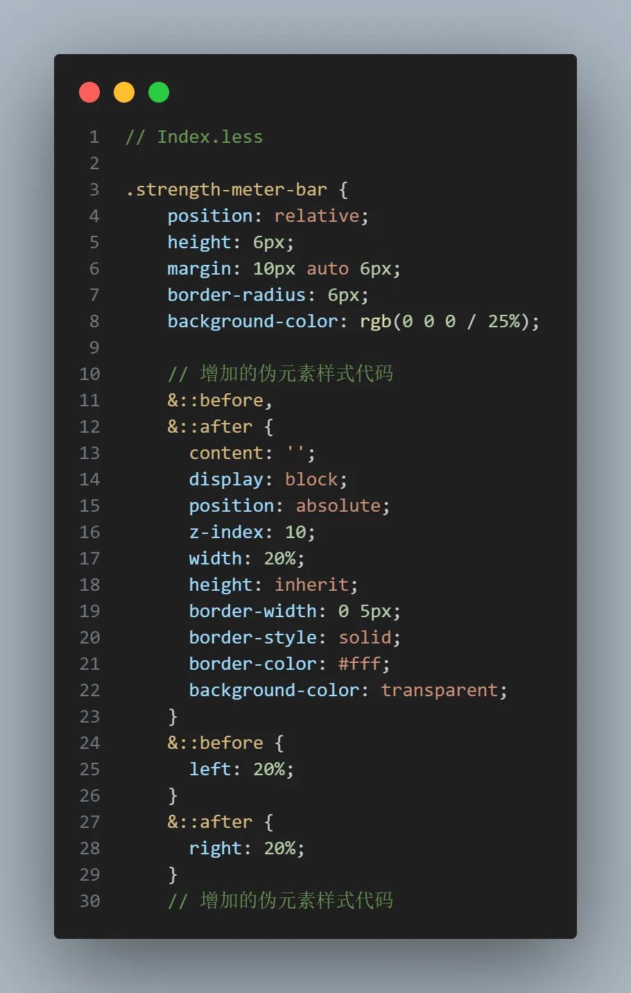
現在可以達到我們期望的效果~
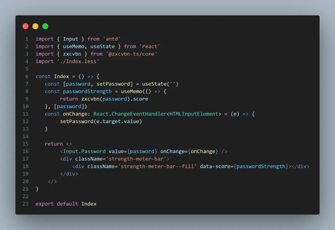
完整代碼
import { Input } from 'antd'
import { useMemo, useState } from 'react'
import { zxcvbn } from '@zxcvbn-ts/core'
import './Index.less'
const Index = () => {
const [password, setPassword] = useState('')
const passwordStrength = useMemo(() => {
return zxcvbn(password).score
}, [password])
const onChange: React.ChangeEventHandler<HTMLInputElement> = (e) => {
setPassword(e.target.value)
}
return <>
<Input.Password value={password} onChange={onChange} />
<div className='strength-meter-bar'>
<div className='strength-meter-bar--fill' data-score={passwordStrength}></div>
</div>
</>
}
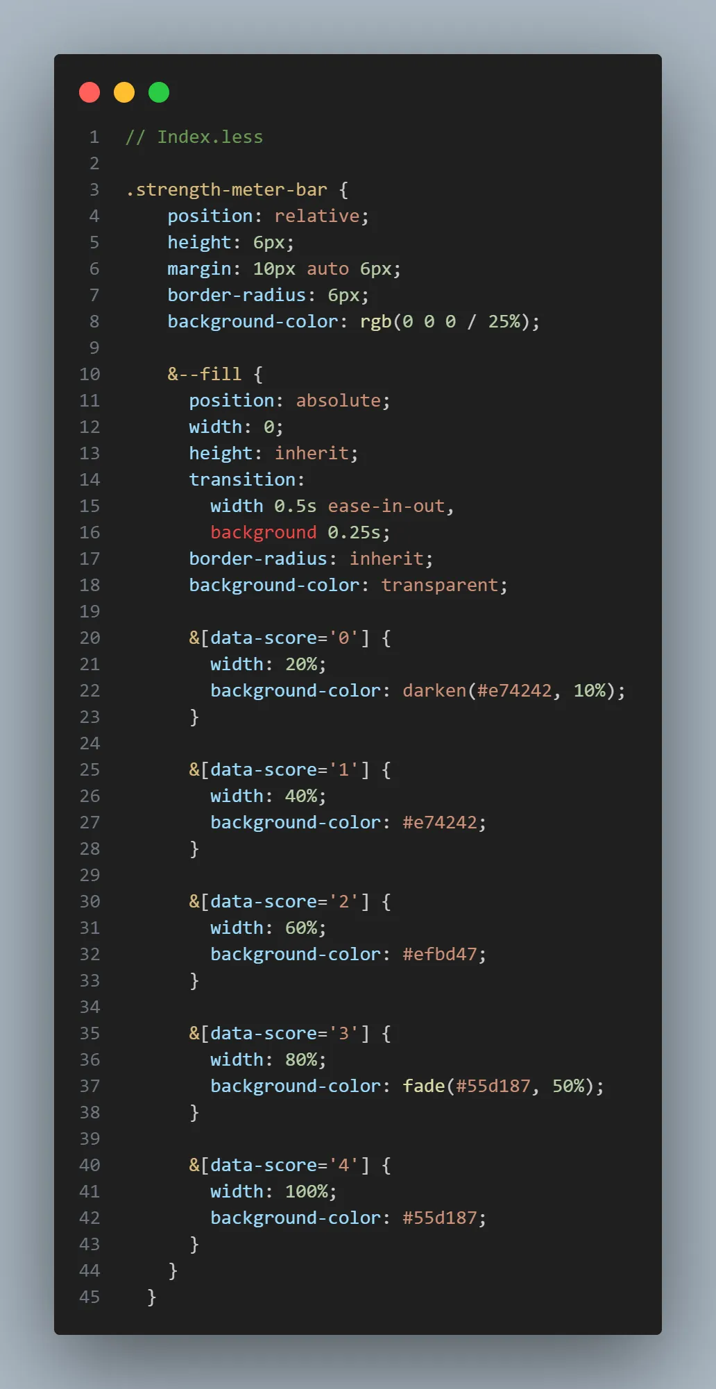
export default Index// Index.less
.strength-meter-bar {
position: relative;
height: 6px;
margin: 10px auto 6px;
border-radius: 6px;
background-color: rgb(0 0 0 / 25%);
// 增加的偽元素樣式代碼
&::before,
&::after {
content: '';
display: block;
position: absolute;
z-index: 10;
width: 20%;
height: inherit;
border-width: 0 5px;
border-style: solid;
border-color: #fff;
background-color: transparent;
}
&::before {
left: 20%;
}
&::after {
right: 20%;
}
// 增加的偽元素樣式代碼
&--fill {
position: absolute;
width: 0;
height: inherit;
transition:
width 0.5s ease-in-out,
background 0.25s;
border-radius: inherit;
background-color: transparent;
&[data-score='0'] {
width: 20%;
background-color: darken(#e74242, 10%);
}
&[data-score='1'] {
width: 40%;
background-color: #e74242;
}
&[data-score='2'] {
width: 60%;
background-color: #efbd47;
}
&[data-score='3'] {
width: 80%;
background-color: fade(#55d187, 50%);
}
&[data-score='4'] {
width: 100%;
background-color: #55d187;
}
}
}
責任編輯:趙寧寧
來源:
前端之神