啥?Python竟然也可以制作萌萌的手繪圖表
作者:佚名
大家可能已經習慣了用Matplotlib和seaborn來制作不同的圖表,但是今天要介紹一個非常酷的Python手繪風格的可視化包:cutecharts。
大家可能已經習慣了用Matplotlib和seaborn來制作不同的圖表,但是今天要介紹一個非常酷的Python手繪風格的可視化包:cutecharts。

這個包可以用來生成以下幾種看起來像手繪的圖表,在某些場景下效果可能更好。這些可愛的圖表還具有交互性和動態性。每當鼠標在圖表上懸停時,數字就會顯示出來。而要創建這種圖表,你只需要幾行Python代碼。
目前,該庫支持五種圖表--條形圖、線形圖、餅圖、雷達圖和散點圖。它還支持圖表的組合。
在開始繪制可愛的圖表之前,我們需要安裝 cutechart 庫。
- $ pip install cutecharts
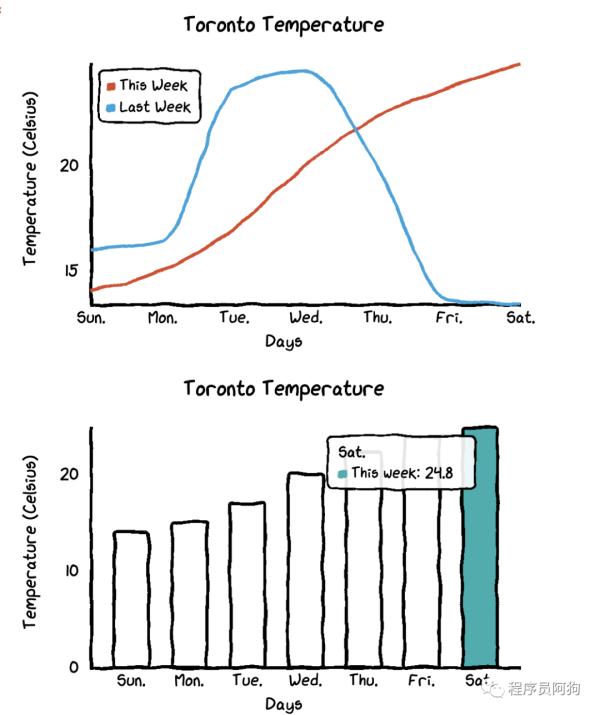
安裝好后我們來嘗試畫下條形圖和線圖。首先創建下數據,以某個城市的溫度數據為例。
- #import library and data
- import cutecharts.charts as ctcdf=pd.DataFrame({ ‘x’:[‘Sun.’,’Mon.’,’Tue.’,’Wed.’,’Thu.’,’Fri.’,’Sat.’], ‘y’:[14,15,17,20,22.3,23.7,24.8], ‘z’:[16,16.4,23.6,24.5,19.9,13.6,13.4]})
1、條形圖
代碼:
- chart = ctc.Bar(‘Toronto Temperature’,width=’500px’,height=’400px’)
- chart.set_options( labels=list(df[‘x’]), x_label='Days', y_label='Temperature (Celsius)' , colors=[‘#1EAFAE’ for i in range(len(df))] )
- chart.add_series('This week',list(df[‘y’]))
- chart.render_notebook()
效果:
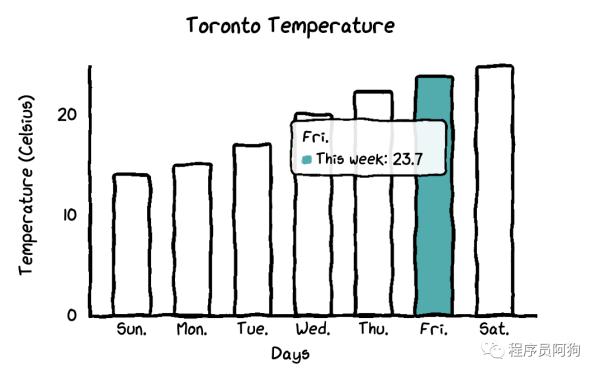
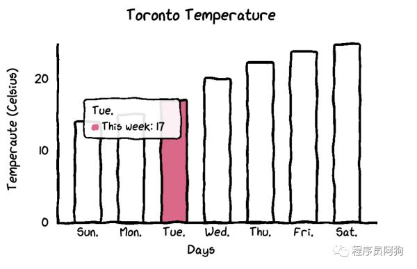
在這個條形圖中,所有的條形圖都有相同的顏色。如果你想自定義每個條形圖的顏色,你只需要更改一行代碼。
- chart = ctc.Bar(‘title’,width=’500px’,height=’400px’)
- chart.set_options( labels=list(df[‘x’]), x_label=”Days”, y_label=”Temperature (Celsius)” , colors=[‘#FFF1C9’,’#F7B7A3',’#EA5F89',’#9B3192',’#57167E’,’#47B39C’,’#00529B’] )
- chart.add_series(“This week”,list(df[‘y’]))
- chart.render_notebook()
2、線圖
如果想觀察時間序列數據的變動差異,線圖無疑更直觀。
代碼:
- chart = ctc.Line(“Toronto Temperature”,width=’500px’,height=’400px’)
- chart.set_options( labels=list(df[‘x’]), x_label=”Days”, y_label=”Temperature (Celsius)” )
- chart.add_series(“This Week”, list(df[‘y’]))
- chart.add_series(“Last Week”, list(df[‘z’]))
- chart.render_notebook()
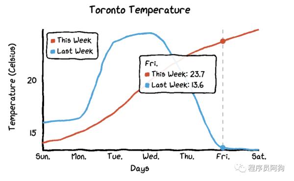
還有一個特別的功能:
當你把鼠標懸停在圖表上時,圖表會自動顯示帶有數字的標簽,而且還畫了一條虛線,這樣本周和上周的氣溫差異就更加直觀了。
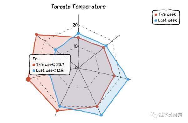
3、雷達圖
要將線型圖改為雷達圖,你只需要將圖表類型改為ctc.Radar。
代碼:
- chart = ctc.Radar(‘Toronto Temperature’,width=’700px’,height=’600px’)
- chart.set_options( labels=list(df[‘x’]), is_show_legend=True, #by default, it is true. You can turn it off. legend_pos=’upRight’ #location of the legend )
- chart.add_series(‘This week’,list(df[‘y’]))
- chart.add_series(“Last week”,list(df[‘z’]))
- chart.render_notebook()
效果:
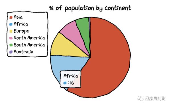
4、餅圖
我們需要另一個數據集來制作餅圖和甜甜圈圖。
創建數據集:
- df=pd.DataFrame({‘x’:[‘Asia’, ‘Africa’, ‘Europe’, ‘North America’, ‘South America’, ‘Australia’], ‘y’:[59.69, 16, 9.94, 7.79, 5.68, 0.54]})
這個數據集包含了大洲名稱和人口占比。
- chart = ctc.Pie(‘% of population by continent’,width=’500px’,height=’400px’)
- chart.set_options( labels=list(df[‘x’]), inner_radius=0 )
- chart.add_series(list(df[‘y’]))
- chart.render_notebook()
效果:
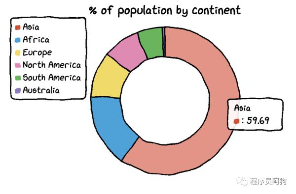
而且把餅圖變成甜甜圈圖也很容易。你只需要改變inner_radius的參數。
代碼:
- df=pd.DataFrame({‘x’:[‘Asia’, ‘Africa’, ‘Europe’, ‘North America’, ‘South America’, ‘Australia’], ‘y’:[59.69, 16, 9.94, 7.79, 5.68, 0.54]})
- chart = ctc.Pie(‘% of population by continent’,width=’500px’,height=’400px’)
- chart.set_options( labels=list(df[‘x’]), inner_radius=0.6 )
- chart.add_series(list(df[‘y’]))
- chart.render_notebook()
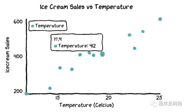
5、散點圖
為了繪制散點圖,我將創建一個新的數據集。這次我們用到的是溫度和冰淇淋銷量數據。
數據集:
- Temperature = [14.2,16.4,11.9,15.2,18.5,22.1,19.4,25.1,23.4,18.1,22.6,17.2]
- Sales = [215,325,185,332,406,522,412,614,544,421,445,408]
散點圖代碼:
- chart = ctc.Scatter(‘Ice Cream Sales vs Temperature’,width=’500px’,height=’600px’)
- chart.set_options( x_label=”Temperature (Celcius)”, y_label=”Icecream Sales” , colors=[‘#1EAFAE’], is_show_line = False, dot_size=1)
- chart.add_series(“Temperature”, [(z[0], z[1]) for z in zip(Temperature, Sales)])
- chart.render_notebook()
6、組合圖
如果你想把多個圖表組合在一起,那么代碼也不復雜。
- chart1 = ctc.Line(“Toronto Temperature”,width=’500px’,height=’400px’)
- chart1.set_options( labels=list(df[‘x’]), x_label=”Days”, y_label=”Temperature (Celsius)” )
- chart1.add_series(“This Week”, list(df[‘y’]))
- chart1.add_series(“Last Week”, list(df[‘z’]))
- chart2 = ctc.Bar(‘Toronto Temperature’,width=’500px’,height=’400px’)
- chart2.set_options( labels=list(df[‘x’]), x_label=”Days”, y_label=”Temperature (Celsius)” , colors=[‘#1EAFAE’ for i in range(len(df))] )
- chart2.add_series(“This week”,list(df[‘y’]))
- chart2.add_series(“Last week”,list(df[‘z’]))
- page = Page()page.add(chart1, chart2)
- page.render_notebook()
cutecharts這個包非常簡單易用,如果你也喜歡這個風格的圖表,就趕快試一下。
責任編輯:龐桂玉
來源:
光明網