基于HarmonyOS ArkUI 3.0框架,我成功開發了流式布局網絡語
一、前言
在介紹之前,吐槽一下為什么文檔Ets組件里沒有文本輸入框,這么基礎的組件都不先提供的,好的當時在HDC大會體驗Ets實例時,見到有用輸入框,名叫TextInput,在開發工具是沒有提示的,然后我也嘗試用它來為我的Demo提供輸入,然而發現個問題,當我把TextInput組件里的text屬于綁定@State 定義變量時,每次在文本框輸入內容,點擊按鈕,清空變量值,這時文本輸入框也清空了,但當我再次輸入內容時,輸入文本框會追加上次的內容,估計是因為TextInput有這個Bug,所以還沒有在文檔上顯示出來。
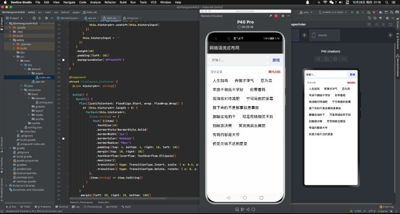
簡單介紹一下本文的實現效果,在文本輸入框輸入流行網絡用語,點擊新增按鈕,把流行網絡用語添加到下面流式布局的組件里,文以x、y軸縮放從0.5變化到1,透明度從0到1 顯示出來,點擊隨機刪除按鈕時,從下面流行網絡用語中隨機刪除一個,并且以沿y軸旋轉360度消失。
二、實現效果

三、創建工程
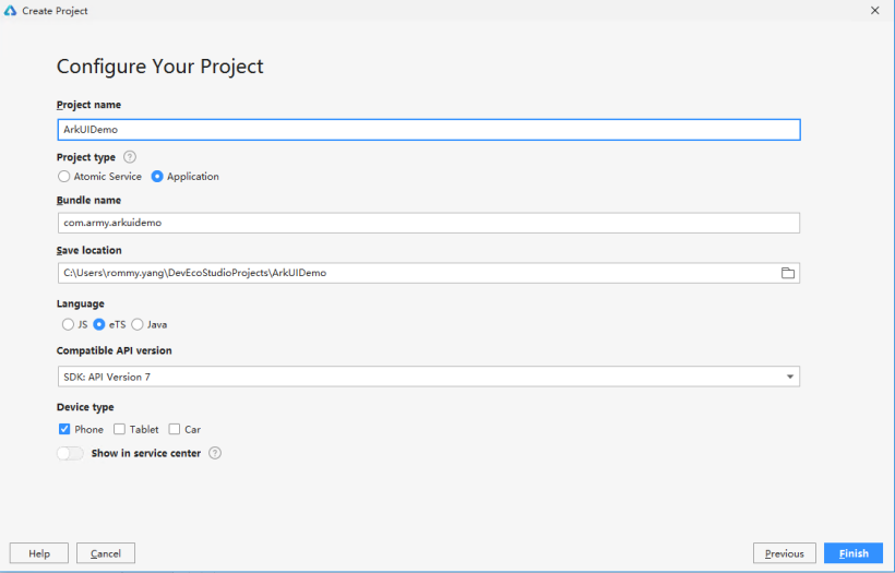
在這當作你已經安裝好最新版本DevEco-Studio開發工具, 點擊File -> New -> New Project… 彈出Create HarmonyOS Project窗口, 這里我選擇空白eTS模板創建, 下來就跟著一起玩轉HarmonyOS ArkUI 3.0 框架聲明式開發吧.
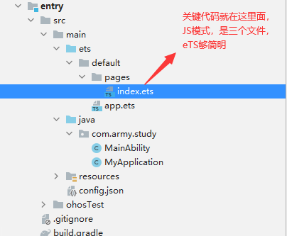
四、界面開發
界面有三個組件組合而成,文本輸入框和新增按鈕組合成一個自定義組件, 歷史記錄和隨機刪除按鈕組合成一個自定義組件,滾動組件和多個文本組件組合成一個自定義組件,下面我們分別從上到下來介紹自定義組件:
- @Entry
- @Component
- struct Search_FlowLayout {
- @State historyArr:string[] = ["人生如戲", "養豬才洋氣", "忍為高", "牢房不倒我不學好", "你帶著錢", "我消極對待減肥", "寧可高傲的發霉", "接下來的不是故事就是事故", "腳踏實地的干", "可是用錢卻買不到", "拍腦袋決策", "笑完我就去睡覺", "有錢的都是大爺","但是欠錢不還的更是"]
- build() {
- Column() {
- // 文本輸入框和新增按鈕組合自定義組件
- Search_Input({historyArr: $historyArr})
- // 歷史記錄和隨機刪除按鈕組合成自定義組件
- Clear_History({historyArr: $historyArr})
- // 滾動組件和多個文本組件組合成自定義組件
- Flowlayout_Container({historyArr: $historyArr})
- }
- .alignItems(HorizontalAlign.Center)
- }
- }
實現組件內轉場動效,通過點擊新增按鈕或隨機刪除按鈕來控制Text組件的添加和移除,呈現容器組件子組件添加和移除時的動效。
這里用到組件轉場動畫,簡單說一下組件轉場主要通過transition屬性方法配置轉場參數,在組件添加和移除時會執行過渡動效,需要配合animteTo才能生效。動效時長、曲線、延時跟隨animateTo中的配置。
文本輸入框和新增按鈕組合,在新增按鈕的onClick事件中添加animateTo方法,來使下面Text子組件動效生效。
- @Component
- struct Search_Input {
- // 存儲文本輸入框內容
- @State historyInput: string = ''
- // 鏈接主入口歷史記錄數組
- @Link historyArr: string[]
- build() {
- // Flex布局,居中顯示
- Flex({ alignItems: ItemAlign.Center }){
- // 文本輸入框
- TextInput({ placeholder: '請輸入...', text: this.historyInput })
- .type(InputType.Normal)
- .placeholderColor(Color.Gray)
- .placeholderFont({ size: 50, weight: 2})
- .enterKeyType(EnterKeyType.Search)
- .caretColor(Color.Green)
- .layoutWeight(8)
- .height(40)
- .borderRadius('20px')
- .backgroundColor(Color.White)
- .onChange((value: string) => {
- this.historyInput = value
- })
- // 新增網絡用語按鈕
- Button({type: ButtonType.Capsule, stateEffect:false}) {
- Text('新增').fontSize(17).fontColor(Color.Blue)
- }
- .layoutWeight(2)
- .backgroundColor('#00000000')
- .onClick((event: ClickEvent) => {
- if (this.historyInput != null && this.historyInput.length > 0) {
- // 添加animateTo方法,來使Text組件子組件動效生效
- animateTo({ duration: 600 }, () => {
- this.historyArr.unshift(this.historyInput)
- })
- }
- this.historyInput = ''
- })
- }
- .height(60)
- .padding({left: 10})
- .backgroundColor('#FFedf2f5')
- }
- }
歷史記錄和隨機刪除按鈕組合
- @Component
- struct Clear_History {
- // 鏈接主入口歷史記錄數組
- @Link historyArr: string[]
- build() {
- Flex({ alignItems: ItemAlign.Center }) {
- if (this.historyArr.length > 0) {
- Text('歷史記錄')
- .fontSize(14)
- .fontColor(Color.Grey)
- .layoutWeight(5)
- Text('隨機刪除')
- .textAlign(TextAlign.End)
- .margin({right: 30})
- .fontSize(14)
- .fontColor(Color.Red)
- .layoutWeight(5)
- .onClick((event: ClickEvent) => {
- // 添加animateTo方法,來使Text組件子組件動效生效
- // 隨機從歷史記錄刪除一個
- animateTo({ duration: 600 }, () => {
- var idx = Math.floor(Math.random()*this.historyArr.length);
- this.historyArr.splice(idx, 1)
- })
- })
- }
- }
- .height(40)
- .padding({ left: 20, top: 10 })
- }
- }
滾動組件和多個文本組件組合成, 給Text組件添加兩個transition屬性,分別用于定義組件的添加動效和移除動效。
- @Component
- struct Flowlayout_Container {
- // 鏈接主入口歷史記錄數組
- @Link historyArr: string[]
- build() {
- // 滾動組件
- Scroll() {
- // Flex布局, wrap為FlexWrap.Wrap為流式布局
- Flex({justifyContent: FlexAlign.Start, wrap: FlexWrap.Wrap}) {
- if (this.historyArr.length > 0) {
- // 循環顯示出網絡用語到文本組件
- ForEach(this.historyArr,
- (item:string) => {
- Text(`${item}`)
- .fontSize(18)
- .borderStyle(BorderStyle.Solid)
- .borderWidth('1px')
- .borderColor('#dddddd')
- .borderRadius('90px')
- .padding({top: 4, bottom: 4, right: 10, left: 10})
- .margin({top: 10, right: 10})
- .textOverflow({overflow: TextOverflow.Ellipsis})
- .maxLines(2)
- // 新增網絡用語時的動畫
- .transition({ type: TransitionType.Insert, scale: { x: 0.5, y: 0.5 }, opacity: 0 })
- // 隨機刪除網絡用語的動畫
- .transition({ type: TransitionType.Delete, rotate: { x: 0, y: 1, z: 0, angle: 360 }, scale: { x: 0, y: 0 } })
- },
- (item:string) => item.toString()
- )
- }
- }
- .margin({left: 20, right: 10, bottom: 100})
- .padding({bottom: 10})
- }
- }
- }
介紹就到此了,聲明式開發,是不是簡潔了很多,大家一起擼起來吧。