輕松玩轉HarmonyOS ArkUI 3.0 開發實戰—合成1024
前言
HarmonyOS ArkUI 3.0正式到來,今天就給大家分享一下我的HarmonyOS ArkUI 3.0 框架試玩初體驗,以合成1024的開發實戰,帶大家感受一下HarmonyOS ArkUI 3.0的極簡開發。
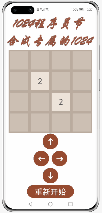
效果圖
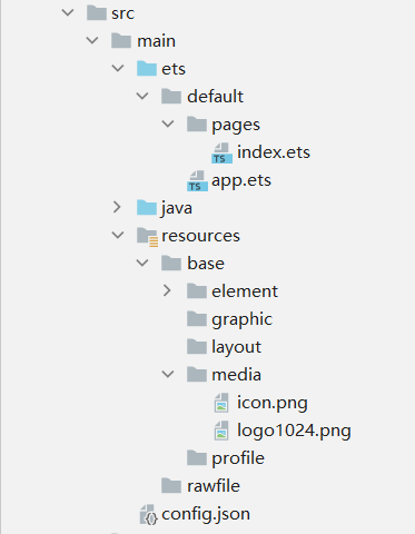
代碼文件結構
正文
一、創建一個空白的工程
1. 安裝和配置DevEco Studio
DevEco Studio下載、DevEco Studio安裝
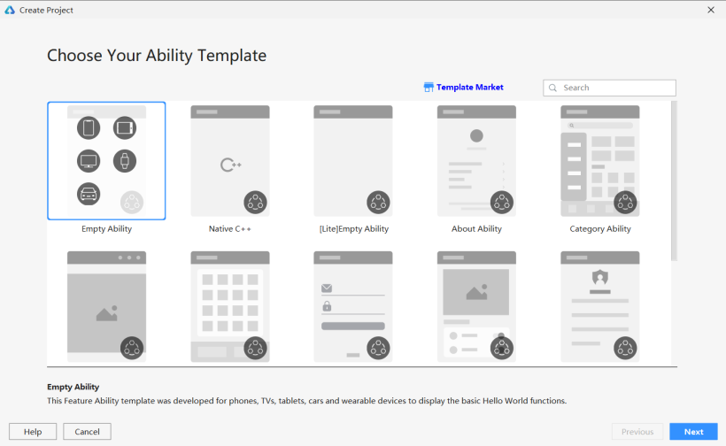
2. 創建一個Empty Ability應用
DevEco Studio下載安裝成功后,打開DevEco Studio,點擊左上角的File,點擊New,再選擇New Project,選擇Empty Ability選項,點擊Next按鈕
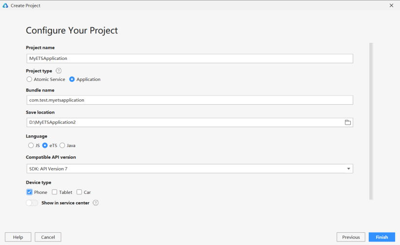
將文件命名為MyETSApplication(文件名不能出現中文或者特殊字符,否則將無法成功創建項目文件),Project Type勾選Application,選擇保存路徑,Language勾選eTS,選擇API7,設備勾選Phone,最后點擊Finish按鈕。
3. 準備工作
在entry>src>main>config.json文件中最下方"launchType": "standard"的后面添加以下代碼,這樣就可以實現去掉應用上方的標簽欄了。
config.json最下方部分代碼:
- "metaData": {
- "customizeData": [
- {
- "name": "hwc-theme",
- "value": "androidhwext:style/Theme.Emui.Light.NoTitleBar",
- "extra": ""
- }
- ]
- }
二、實現界面布局
1. 保存圖片
將logo圖片保存到entry>src>main>resources>base>media文件中。
2. 新一代的聲明式UI開發范式
具體而言,ArkUI 3.0中的新一代聲明式UI開發范式,主要特征如下:
(1)基于TypeScript擴展的聲明式UI描述語法,提供了類自然語言的UI描述和組合。
(2)開箱即用的多態組件。多態是指UI描述是統一的,UI呈現在不同類型設備上會有所不同。比如Button組件在手機和手表會有不同的樣式和交互方式。
(3)多維度的狀態管理機制,支持靈活的數據驅動的UI變更。
裝飾器:用來裝飾類、結構體、方法以及變量,賦予其特殊的含義,如上述示例中@Entry、@Component、@State都是裝飾器。@Component表示這是個自定義組件;@Entry則表示這是個入口組件;@State表示組件中的狀態變量,這個狀態變化會引起UI變更。
自定義組件:可復用的UI單元,可組合其它組件,如上述被@Component裝飾的struct Hello。
UI描述:聲明式的方式來描述UI的結構,如上述build()方法內部的代碼塊。
內置組件:框架中默認內置的基礎和布局組件,可直接被開發者調用,比如示例中的Column、Text、Divider、Button。
事件方法:用于添加組件對事件的響應邏輯,統一通過事件方法進行設置,如跟隨在Button后面的onClick()。
屬性方法:用于組件屬性的配置,統一通過屬性方法進行設置,如fontSize()、width()、height()、color()等,可通過鏈式調用的方式設置多項屬性。
3. 實現界面
這一次程序用到的裝飾器分別有 @Entry 、 @Component、@State和 @Link 。
裝飾器 @Entry 裝飾的自定義組件用作頁面的默認入口組件,加載頁面時,將首先創建并呈現@Entry裝飾的自定義組件。要注意的是:在單個源文件中,最多可以使用@Entry裝飾一個自定義組件。
裝飾器 @Component 裝飾的struct表示該結構體具有組件化能力,能夠成為一個獨立的組件,這種類型的組件也稱為自定義組件。該組件可以組合其他組件,它通過實現build方法來描述UI結構。
組件生命周期包括aboutToAppear、aboutToDisappear、onPageShow、onPageHide和onBackPress
aboutToAppear:函數在創建自定義組件的新實例后,在執行其build函數之前執行。允許在aboutToAppear函數中改變狀態變量,這些更改將在后續執行build函數中生效。
aboutToDisappear:函數在自定義組件析構消耗之前執行。不允許在aboutToDisappear函數中改變狀態變量,特別是@Link變量的修改可能會導致應用程序行為不穩定。
onPageShow:當此頁面顯示時觸發一次。包括路由過程、應用進入前后臺等場景,僅@Entry修飾的自定義組件生效。
onPageHide:當此頁面消失時觸發一次。包括路由過程、應用進入前后臺等場景,僅@Entry修飾的自定義組件生效。
onBackPress:當用戶點擊返回按鈕時觸發,,僅@Entry修飾的自定義組件生效。
裝飾器 @State 裝飾的變量是組件內部的狀態數據,當這些狀態數據被修改時,將會調用所在組件的build方法進行UI刷新。要注意的是,標記為@State的屬性不能直接在組件外部修改,必須為所有@State變量分配初始值。
裝飾器 @Link 裝飾的變量可以和父組件的@State變量建立雙向數據綁定。要注意的是,@Link變量不能在組件內部進行初始化,在創建組件的新實例時,必須使用命名參數初始化所有@Link變量。@Link變量可以使用@State變量或@Link變量的引用進行初始化。@State變量可以通過’$'操作符創建引用。
index.ets:
先定義一個方格的背景顏色字典colors,用以繪制不同數字的背景顏色,和一個全局變量number,用以ForEach的鍵值生成。
- var number = 1
- const colors={
- "0": "#CDC1B4",
- "2": "#EEE4DA",
- "4": "#ECE0C6",
- "8": "#F2B179",
- "16": "#F59563",
- "32": "#F67C5F",
- "64": "#F65E3B",
- "128": "#EDCF72",
- "256": "#EDCC61",
- "512": "#99CC00",
- "1024": "#83AF9B",
- "2048": "#0099CC",
- "4096": "#0099CC",
- "8192": "#0099CC"
- }
對于4 x 4的方格,如果要一個一個繪制,那么就需要重復繪制16個Text組件,而且這些Text組件除了文本之外,其他屬性值都是一樣的,這樣極其繁瑣且沒有必要,體現不了HarmonyOS ArkUI 3.0的極簡開發。我們可以把4 x 4的方格以每一行定義成一個組件,每一行每一行地繪制,這樣能夠極大的減少代碼量。
對于每一行組件,傳統的方式是重復繪制4個Text組件,而且這些Text組件除了文本之外,其他屬性值都是一樣的,同樣極其繁瑣且沒有必要,我們可以采用ForEach循環渲染來繪制:
- 第一個參數必須是數組:允許空數組,空數組場景下不會創建子組件。同時允許設置返回值為數組類型的函數,例如arr.slice(1, 3),設置的函數不得改變包括數組本身在內的任何狀態變量,如Array.splice、Array.sort或Array.reverse這些原地修改數組的函數;
- 第二個參數用于生成子組件的lambda函數。它為給定數組項生成一個或多個子組件。單個組件和子組件列表必須括在大括號“{…}”中;
- 可選的第三個參數是用于鍵值生成的匿名函數。它為給定數組項生成唯一且穩定的鍵值。當子項在數組中的位置更改時,子項的鍵值不得更改,當數組中的子項被新項替換時,被替換項的鍵值和新項的鍵值必須不同。鍵值生成器的功能是可選的。但是,出于性能原因,強烈建議提供,這使開發框架能夠更好地識別數組更改。如單擊進行數組反向時,如果沒有提供鍵值生成器,則ForEach中的所有節點都將重建。
使用裝飾器@Component,自定義一個每一行的組件,用裝飾器@Link定義一個數組grids。在build()里面添加彈性布局Flex,使用循環渲染ForEach來繪制組件Text。對于每一個Text組件,文本判斷是否為0,如果值為0,則不顯示,背景顏色采用剛才定義好的背景顏色字典colors對應的背景顏色,文本顏色判斷其值是否為2或4,如果為2或4,則采用顏色#645B52,否則采用背景顏色白色。
- @Component
- struct setText {
- @Link grids: number[]
- build() {
- Flex({ justifyContent: FlexAlign.Center, alignItems: ItemAlign.Center, direction: FlexDirection.Row }) {
- ForEach(this.grids,
- (item: number) => Text(item == 0 ? '' : item.toString())
- .width(70)
- .height(70)
- .textAlign(TextAlign.Center)
- .fontSize(30)
- .margin({ left: 5, top: 5, right: 5, bottom: 5 })
- .backgroundColor(colors[item.toString()])
- .fontColor((item == 2 || item == 4) ? '#645B52' : '#FFFFFF'),
- (item: number) => (number++) + item.toString())
- }
- }
- }
同理,使用裝飾器@Component,自定義一個按鈕Button組件,用以繪制上下左右四個按鈕。
- @Component
- struct setButton {
- private dirtext: string
- private dir: string
- @Link Grids: number[][]
- @Link grid1: number[]
- @Link grid2: number[]
- @Link grid3: number[]
- @Link grid4: number[]
- build() {
- Button(this.dirtext)
- .width(60)
- .height(60)
- .fontSize(30)
- .fontWeight(FontWeight.Bold)
- .align(Alignment.Center)
- .backgroundColor('#974B31')
- .fontColor('#FFFFFF')
- .margin({ left: 5, top: 3, right: 5, bottom: 3 })
- }
- }
在裝飾器@Entry裝飾的結構體的build()中,將原來的代碼全部刪掉。
使用裝飾器@State定義一個二維數組和四個一維數組,添加垂直布局Column,寬和高都為100%,背景顏色為白色,在其中添加Image組件,引用剛才保存好的logo圖片,再添加一個寬和高都是320,背景顏色為#BBADA0的垂直布局Column,在其添加四個剛才定義好的行組件setText。
在外圍的垂直布局Column中再添加四個剛才定義好的按鈕組件setButton,其中中間兩個按鈕組件位于彈性布局Flex中,最后添加一個Button組件,文本內容為“重新開始”。
- @Entry
- @Component
- struct Index {
- @State grids: number[][] = [[0, 0, 0, 0],
- [0, 2, 0, 0],
- [0, 0, 2, 0],
- [0, 0, 0, 0]]
- @State grid1: number[] = [this.grids[0][0], this.grids[0][1], this.grids[0][2], this.grids[0][3]]
- @State grid2: number[] = [this.grids[1][0], this.grids[1][1], this.grids[1][2], this.grids[1][3]]
- @State grid3: number[] = [this.grids[2][0], this.grids[2][1], this.grids[2][2], this.grids[2][3]]
- @State grid4: number[] = [this.grids[3][0], this.grids[3][1], this.grids[3][2], this.grids[3][3]]
- build() {
- Column() {
- Image($r('app.media.logo1024')).width('100%').height(140).align(Alignment.Center)
- Column() {
- setText({ grids: $grid1 })
- setText({ grids: $grid2 })
- setText({ grids: $grid3 })
- setText({ grids: $grid4 })
- }
- .width(320)
- .height(320)
- .backgroundColor("#BBADA0")
- setButton({dirtext: '↑', dir: 'up', Grids: $grids, grid1: $grid1, grid2: $grid2, grid3: $grid3, grid4: $grid4})
- Flex({ justifyContent: FlexAlign.Center, alignItems: ItemAlign.Center, direction: FlexDirection.Row }) {
- setButton({dirtext: '←', dir: 'left', Grids: $grids, grid1: $grid1, grid2: $grid2, grid3: $grid3, grid4: $grid4})
- setButton({dirtext: '→', dir: 'right', Grids: $grids, grid1: $grid1, grid2: $grid2, grid3: $grid3, grid4: $grid4})
- }
- setButton({dirtext: '↓', dir: 'down', Grids: $grids, grid1: $grid1, grid2: $grid2, grid3: $grid3, grid4: $grid4})
- Button('重新開始')
- .width(180)
- .height(50)
- .fontSize(30)
- .align(Alignment.Center)
- .backgroundColor('#974B31')
- .fontColor('#FFFFFF')
- .margin({ left: 5, top: 3, right: 5, bottom: 3 })
- }
- .width('100%')
- .height('100%')
- .backgroundColor("#FFFFFF")
- .alignItems(HorizontalAlign.Center)
- }
- }
三、編寫邏輯代碼
index.ets:
在結構體setButton中添加四個函數:
- addTwoOrFourToGrids():用以隨機生成一個新的方格數字,數字為2或4。
- swipeGrids(direction):用以實現方格的重新生成。
- changeGrids(direction):用以實現方格的上下左右移動。
- changeString():用以將二維數組分成四個一維數組。
最后在Button組件的屬性里添加一個點擊事件,依次調用函數swipeGrids(direction)、addTwoOrFourToGrids()和changeString()。
- @Component
- struct setButton {
- private dirtext: string
- private dir: string
- @Link Grids: number[][]
- @Link grid1: number[]
- @Link grid2: number[]
- @Link grid3: number[]
- @Link grid4: number[]
- addTwoOrFourToGrids() {
- let array = [];
- for (let row = 0; row < 4; row++)
- for (let column = 0;column < 4; column++)
- if (this.Grids[row][column] == 0)
- array.push([row, column]);
- let randomIndes = Math.floor(Math.random() * array.length);
- let row = array[randomIndes][0];
- let column = array[randomIndes][1];
- if (Math.random() < 0.8) {
- this.Grids[row][column] = 2;
- } else {
- this.Grids[row][column] = 4;
- }
- }
- swipeGrids(direction) {
- let newGrids = this.changeGrids(direction);
- if (newGrids.toString() != this.Grids.toString()) {
- this.Grids = newGrids;
- }
- }
- changeGrids(direction) {
- let newGrids = [[0, 0, 0, 0],
- [0, 0, 0, 0],
- [0, 0, 0, 0],
- [0, 0, 0, 0]];
- if (direction == 'left' || direction == 'right') {
- let step = 1;
- if (direction == 'right') {
- step = -1;//step作為循環時數組下標改變的方向
- }
- for (let row = 0; row < 4; row++) {//每一層
- let array = [];
- let column = 0;//如果為left則從0開始right從3開始,
- if (direction == 'right') {
- column = 3;
- }
- for (let i = 0; i < 4; i++) {
- if (this.Grids[row][column] != 0) {//把所有非零元依次放入數組中
- array.push(this.Grids[row][column]);
- }
- column += step;//當direction為left時則從0向3遞增,為right時則從3向0遞減
- }
- for (let i = 0; i < array.length - 1; i++) {//訪問當前元素及他的下一個元素,所有循環次數為length-1
- if (array[i] == array[i + 1]) {//判斷是否可合并,
- array[i] += array[i + 1];//合并,
- array[i + 1] = 0;//合并后參與合并的第二個元素消失
- i++;
- }
- }
- column = 0;
- if (direction == 'right') {
- column = 3;
- }
- for (const elem of array) {
- if (elem != 0) {//跳過array里的空元素
- newGrids[row][column] = elem;//把合并后的狀態賦給新數組grids,
- column += step;
- }
- }
- }
- } else if (direction == 'up' || direction == 'down') {//同理
- let step = 1;
- if (direction == 'down') {
- step = -1;
- }
- for (let column = 0; column < 4; column++) {
- let array = [];
- let row = 0;
- if (direction == 'down') {
- row = 3;
- }
- for (let i = 0; i < 4; i++) {
- if (this.Grids[row][column] != 0) {
- array.push(this.Grids[row][column]);
- }
- row += step;
- }
- for (let i = 0; i < array.length - 1; i++) {
- if (array[i] == array[i + 1]) {
- array[i] += array[i + 1];
- array[i + 1] = 0;
- i++;
- }
- }
- row = 0;
- if (direction == 'down') {
- row = 3;
- }
- for (const elem of array) {
- if (elem != 0) {
- newGrids[row][column] = elem;
- row += step;
- }
- }
- }
- }
- return newGrids;
- }
- changeString() {
- this.grid1 = [this.Grids[0][0], this.Grids[0][1], this.Grids[0][2], this.Grids[0][3]]
- this.grid2 = [this.Grids[1][0], this.Grids[1][1], this.Grids[1][2], this.Grids[1][3]]
- this.grid3 = [this.Grids[2][0], this.Grids[2][1], this.Grids[2][2], this.Grids[2][3]]
- this.grid4 = [this.Grids[3][0], this.Grids[3][1], this.Grids[3][2], this.Grids[3][3]]
- }
- build() {
- Button(this.dirtext)
- .width(60)
- .height(60)
- .fontSize(30)
- .fontWeight(FontWeight.Bold)
- .align(Alignment.Center)
- .backgroundColor('#974B31')
- .fontColor('#FFFFFF')
- .margin({ left: 5, top: 3, right: 5, bottom: 3 })
- .onClick((event: ClickEvent) => {
- this.swipeGrids(this.dir)
- this.addTwoOrFourToGrids()
- this.changeString()
- })
- }
- }
在結構體index中文本內容為“重新開始”的按鈕添加一個點擊事件,用以重新初始化數據。
- @Entry
- @Component
- struct Index {
- @State grids: number[][] = [[0, 0, 0, 0],
- [0, 2, 0, 0],
- [0, 0, 2, 0],
- [0, 0, 0, 0]]
- @State grid1: number[] = [this.grids[0][0], this.grids[0][1], this.grids[0][2], this.grids[0][3]]
- @State grid2: number[] = [this.grids[1][0], this.grids[1][1], this.grids[1][2], this.grids[1][3]]
- @State grid3: number[] = [this.grids[2][0], this.grids[2][1], this.grids[2][2], this.grids[2][3]]
- @State grid4: number[] = [this.grids[3][0], this.grids[3][1], this.grids[3][2], this.grids[3][3]]
- build() {
- Column() {
- Image($r('app.media.logo1024')).width('100%').height(140).align(Alignment.Center)
- Column() {
- setText({ grids: $grid1 })
- setText({ grids: $grid2 })
- setText({ grids: $grid3 })
- setText({ grids: $grid4 })
- }
- .width(320)
- .height(320)
- .backgroundColor("#BBADA0")
- setButton({dirtext: '↑', dir: 'up', Grids: $grids, grid1: $grid1, grid2: $grid2, grid3: $grid3, grid4: $grid4})
- Flex({ justifyContent: FlexAlign.Center, alignItems: ItemAlign.Center, direction: FlexDirection.Row }) {
- setButton({dirtext: '←', dir: 'left', Grids: $grids, grid1: $grid1, grid2: $grid2, grid3: $grid3, grid4: $grid4})
- setButton({dirtext: '→', dir: 'right', Grids: $grids, grid1: $grid1, grid2: $grid2, grid3: $grid3, grid4: $grid4})
- }
- setButton({dirtext: '↓', dir: 'down', Grids: $grids, grid1: $grid1, grid2: $grid2, grid3: $grid3, grid4: $grid4})
- Button('重新開始')
- .width(180)
- .height(50)
- .fontSize(30)
- .align(Alignment.Center)
- .backgroundColor('#974B31')
- .fontColor('#FFFFFF')
- .margin({ left: 5, top: 3, right: 5, bottom: 3 })
- .onClick((event: ClickEvent)=>{
- this.grids = [[0, 0, 0, 0],
- [0, 2, 0, 0],
- [0, 0, 2, 0],
- [0, 0, 0, 0]]
- this.grid1 = [this.grids[0][0], this.grids[0][1], this.grids[0][2], this.grids[0][3]]
- this.grid2 = [this.grids[1][0], this.grids[1][1], this.grids[1][2], this.grids[1][3]]
- this.grid3 = [this.grids[2][0], this.grids[2][1], this.grids[2][2], this.grids[2][3]]
- this.grid4 = [this.grids[3][0], this.grids[3][1], this.grids[3][2], this.grids[3][3]]
- })
- }
- .width('100%')
- .height('100%')
- .backgroundColor("#FFFFFF")
- .alignItems(HorizontalAlign.Center)
- }
- }
寫在最后
HarmonyOS ArkUI 3.0 框架還有很多內容在本次程序中沒有涉及到,例如頁面跳轉、數據管理、分布式數據庫、分布式流轉、分布式協同等等,我會在以后的文章中陸陸續續分享我的實戰操作,希望能與各位一起學習相互交流♪(∇*)