Matplotlib入門篇,也可以很酷炫
哈嘍,大家好。今天寫一篇 Matplotlib 的入門教程。
Matplotlib 是 Python 數據可視化庫,廣泛應用在數據分析和機器學習中。
1. 第一張圖
Matplotlib 支持面向對象和pyplot接口兩種方式畫圖。
以這兩種方式為例,畫出如下圖所示的函數圖。
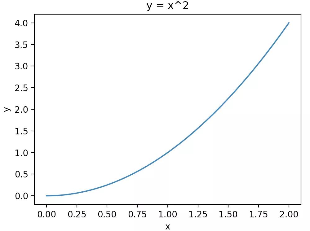
y=x^2
面向對象方式
- import matplotlib.pyplot as plt
- import numpy as np
- x = np.linspace(0, 2, 100)
- fig, ax = plt.subplots()
- ax.plot(x, x**2) # 折線圖
- ax.set_xlabel('x') # 設置橫坐標名稱
- ax.set_ylabel('y') # 設置縱坐標標簽
- ax.set_title("y = x^2") # 設置標題
- plt.show()
plt.subplots() 函數返回fig和ax,分別是Figure對象和Axes對象。前者代表畫布,后者代表畫布上的繪圖區域,很顯然畫布和繪圖區域是一對多的關系。
之后關于繪圖的設置,都通過Axes對象完成。
pyplot方式
- import matplotlib.pyplot as plt
- import numpy as np
- x = np.linspace(0, 2, 100)
- plt.figure()
- plt.plot(x, x**2)
- plt.xlabel('x')
- plt.ylabel('y')
- plt.show()
pyplot方式繪圖和設置都通過plt來完成,沒有對象的概念。
雖然這兩種方式都能畫圖,但官方更建議采用面向對象的方式。
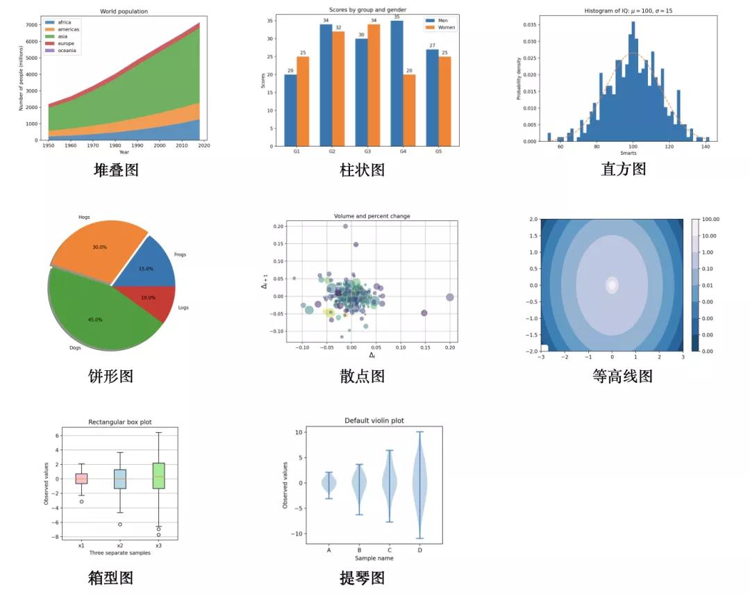
2. 支持多種圖形
除了上面例子中看到的折線圖,Matplotlib 還支持以下圖形:
- stackplot:堆疊圖
- bar/barh:柱狀圖
- hist:直方圖
- pie:餅形圖
- scatter:散點圖
- contourf:等高線圖
- boxplot:箱型圖
- violinplot:提琴圖
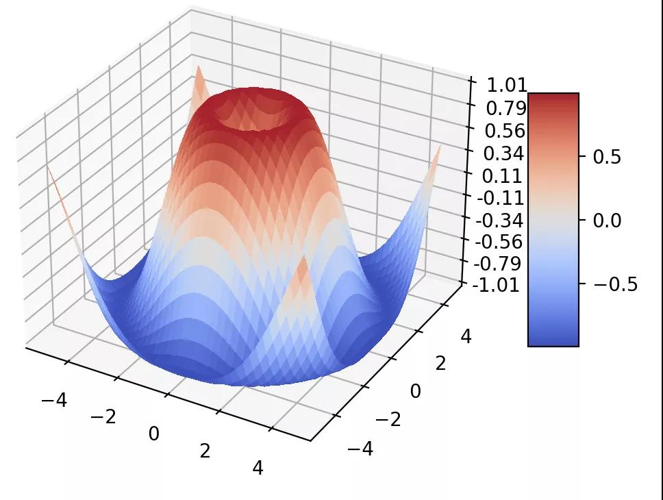
另外,Matplotlib 還是支持 3D 繪圖
3. 常見設置
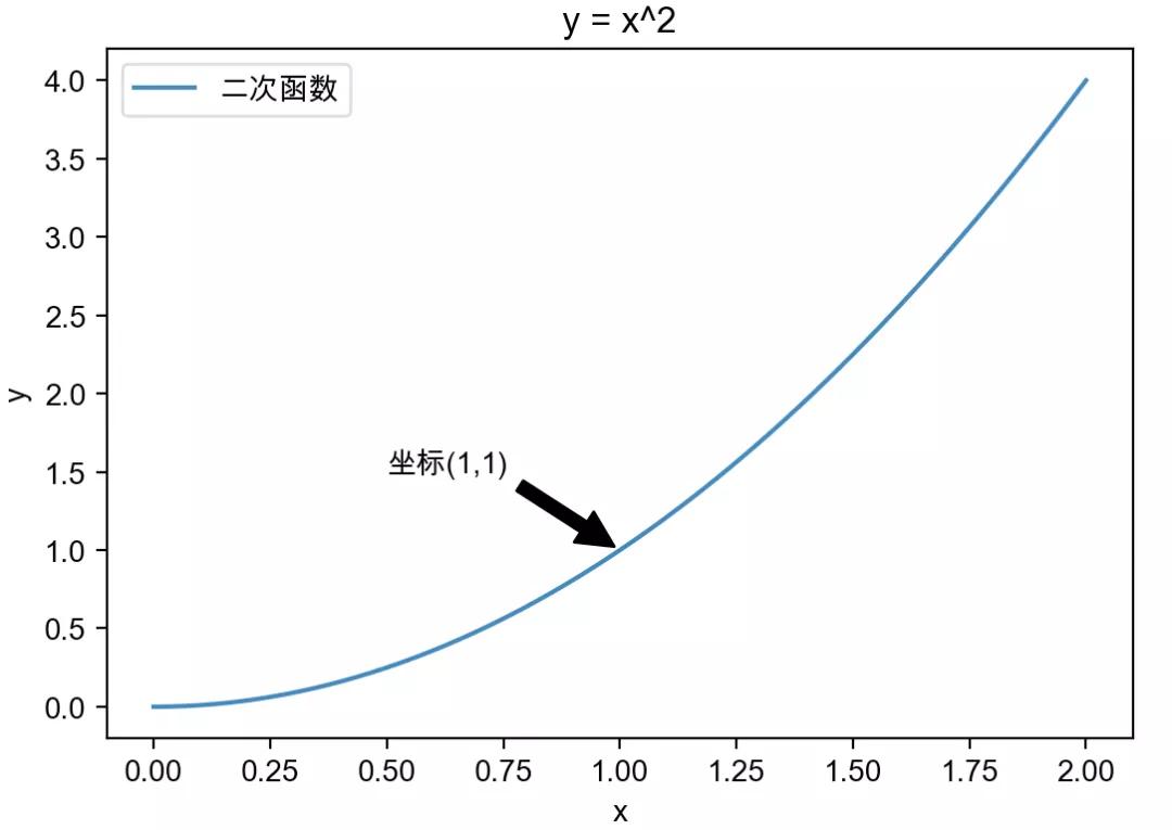
在第一小節的例子里,我們通過set_xlabel和set_title設置坐標軸名稱和標題。
除此之外,還可以添加注釋和圖例。
- x = np.linspace(0, 2, 100)
- fig, ax = plt.subplots()
- ax.plot(x, x**2, label='二次函數')
- ax.set_xlabel('x')
- ax.set_ylabel('y')
- ax.set_title("y = x^2")
- # 添加注釋
- ax.annotate('坐標(1,1)', xy=(1, 1), xytext=(0.5, 1.5),
- arrowprops=dict(facecolor='black', shrink=0.05))
- # 添加圖例
- ax.legend()
還可以設置坐標軸的格式
- ax.xaxis.set_major_formatter('x坐標{x}')

如果坐標軸是日期會非常有用,可以將日期轉成周、月、季度等格式。
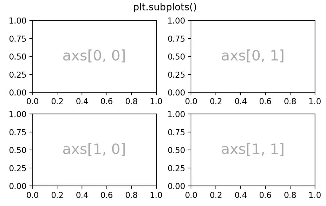
4. 一個畫布多圖形前面提到過,一個畫布可以有多個繪圖區域。
下面使用plt.subplots()函數可以創建2行2列,4個繪圖區域。
- import matplotlib.pyplot as plt
- import numpy as np
- fig, axs = plt.subplots(ncols=2, nrows=2, figsize=(5.5, 3.5),
- constrained_layout=True)
- # add an artist, in this case a nice label in the middle...
- for row in range(2):
- for col in range(2):
- axs[row, col].annotate(f'axs[{row}, {col}]', (0.5, 0.5),
- transform=axs[row, col].transAxes,
- ha='center', va='center', fontsize=18,
- color='darkgrey')
- fig.suptitle('plt.subplots()')
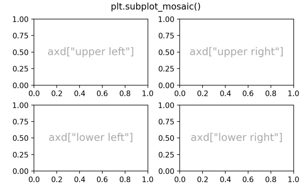
也可以通過subplot_mosaic()函數創建
- fig, axd = plt.subplot_mosaic([['upper left', 'upper right'],
- ['lower left', 'lower right']],
- figsize=(5.5, 3.5), constrained_layout=True)
- for k in axd:
- annotate_axes(axd[k], f'axd["{k}"]', fontsize=14)
- fig.suptitle('plt.subplot_mosaic()')
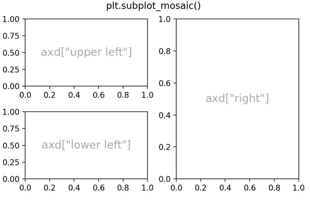
通過subplot_mosaic()函數,還可以將其他幾個繪圖區域合并成一個。
- fig, axd = plt.subplot_mosaic([['upper left', 'right'],
- ['lower left', 'right']],
- figsize=(5.5, 3.5), constrained_layout=True)
- for k in axd:
- annotate_axes(axd[k], f'axd["{k}"]', fontsize=14)
- fig.suptitle('plt.subplot_mosaic()')
通過 GridSpec 也可以創建更復雜的繪圖區域。
- fig = plt.figure(constrained_layout=True)
- gs0 = fig.add_gridspec(1, 2)
- gs00 = gs0[0].subgridspec(2, 2)
- gs01 = gs0[1].subgridspec(3, 1)
- for a in range(2):
- for b in range(2):
- ax = fig.add_subplot(gs00[a, b])
- annotate_axes(ax, f'axLeft[{a}, {b}]', fontsize=10)
- if a == 1 and b == 1:
- ax.set_xlabel('xlabel')
- for a in range(3):
- ax = fig.add_subplot(gs01[a])
- annotate_axes(ax, f'axRight[{a}, {b}]')
- if a == 2:
- ax.set_ylabel('ylabel')
- fig.suptitle('nested gridspecs')
5. 高級用法
Matplotlib 很強大,設置很靈活,比如,折線圖可以用極坐標畫圖
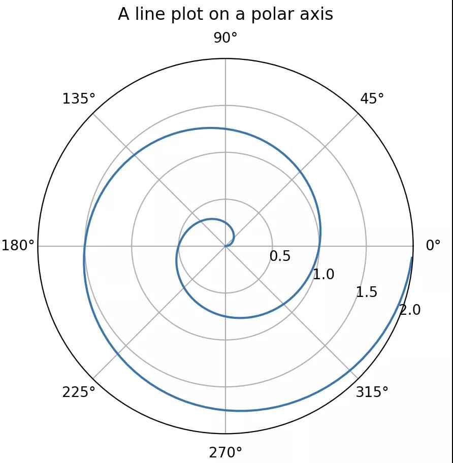
稍加改造還可以畫出玫瑰圖。
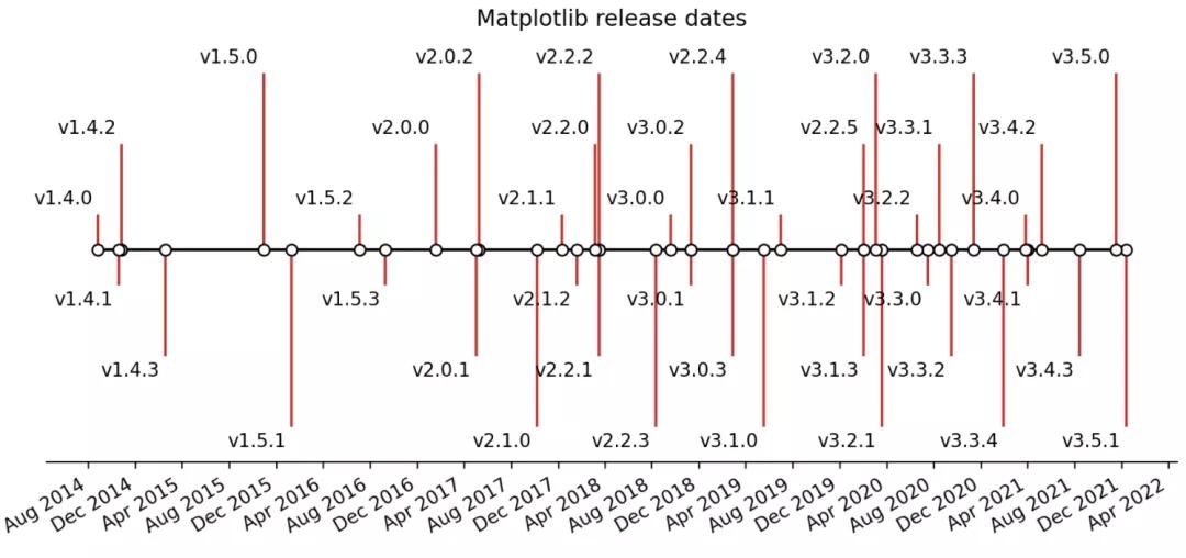
折線圖隱藏坐標軸和邊框,再結合注釋就可以畫出時間軸
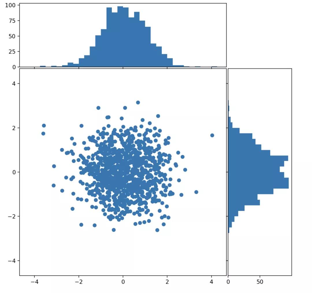
多圖組合形成更復雜的統計圖
Matpolitlib還支持圖形動畫和交互式。
今天這篇文章只介紹了 Maptplotlib 很初級的一部分內容,它本身內容非常豐富、也很復雜。后面有機會我們可以介紹更深入的內容。
如果本文對你有用就點個 在看 鼓勵一下吧。