使用輪廓分數提升時間序列聚類的表現
我們將使用輪廓分數和一些距離指標來執行時間序列聚類實驗,并且進行可視化
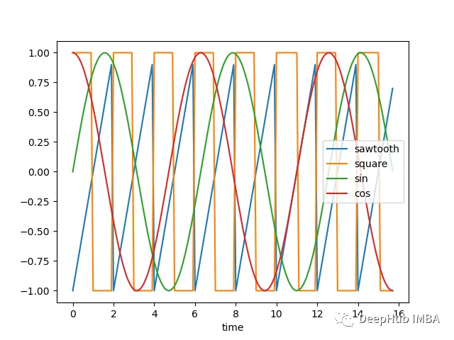
讓我們看看下面的時間序列:
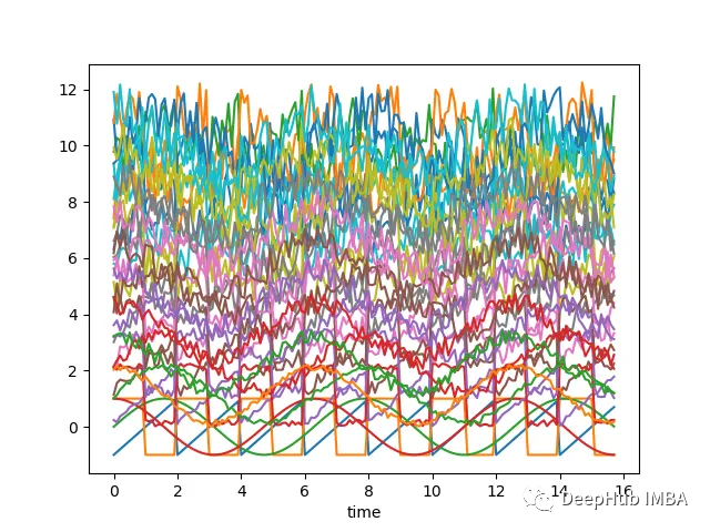
如果沿著y軸移動序列添加隨機噪聲,并隨機化這些序列,那么它們幾乎無法分辨,如下圖所示-現在很難將時間序列列分組為簇:
上面的圖表是使用以下腳本創建的:
# Import necessary libraries
 import os
 import pandas as pd
 import numpy as np

 # Import random module with an alias 'rand'
 import random as rand
 from scipy import signal

 # Import the matplotlib library for plotting
 import matplotlib.pyplot as plt

 # Generate an array 'x' ranging from 0 to 5*pi with a step of 0.1
 x = np.arange(0, 5*np.pi, 0.1)

 # Generate square, sawtooth, sin, and cos waves based on 'x'
 y_square = signal.square(np.pi * x)
 y_sawtooth = signal.sawtooth(np.pi * x)
 y_sin = np.sin(x)
 y_cos = np.cos(x)

 # Create a DataFrame 'df_waves' to store the waveforms
 df_waves = pd.DataFrame([x, y_sawtooth, y_square, y_sin, y_cos]).transpose()

 # Rename the columns of the DataFrame for clarity
 df_waves = df_waves.rename(columns={0: 'time',
                                    1: 'sawtooth',
                                    2: 'square',
                                    3: 'sin',
                                    4: 'cos'})

 # Plot the original waveforms against time
 df_waves.plot(x='time', legend=False)
 plt.show()

 # Add noise to the waveforms and plot them again
 for col in df_waves.columns:
    if col != 'time':
        for i in range(1, 10):
            # Add noise to each waveform based on 'i' and a random value
            df_waves['{}_{}'.format(col, i)] = df_waves[col].apply(lambda x: x + i + rand.random() * 0.25 * i)

 # Plot the waveforms with added noise against time
 df_waves.plot(x='time', legend=False)
 plt.show()
現在我們需要確定聚類的基礎。這里有兩種方法:
把接近于一組的波形分組——較低歐幾里得距離的波形將聚在一起。
把看起來相似的波形分組——它們有相似的形狀,但歐幾里得距離可能不低。
距離度量
一般來說,我們希望根據形狀對時間序列進行分組,對于這樣的聚類-可能希望使用距離度量,如相關性,這些度量或多或少與波形的線性移位無關。
讓我們看看上面定義的帶有噪聲的波形對之間的歐幾里得距離和相關性的熱圖:
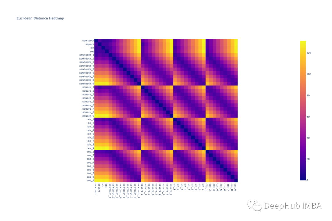
可以看到歐幾里得距離對波形進行分組是很困難的,因為任何一組波形對的模式都是相似的。例如,除了對角線元素外,square & cos之間的相關形狀與square和square之間的相關形狀非常相似
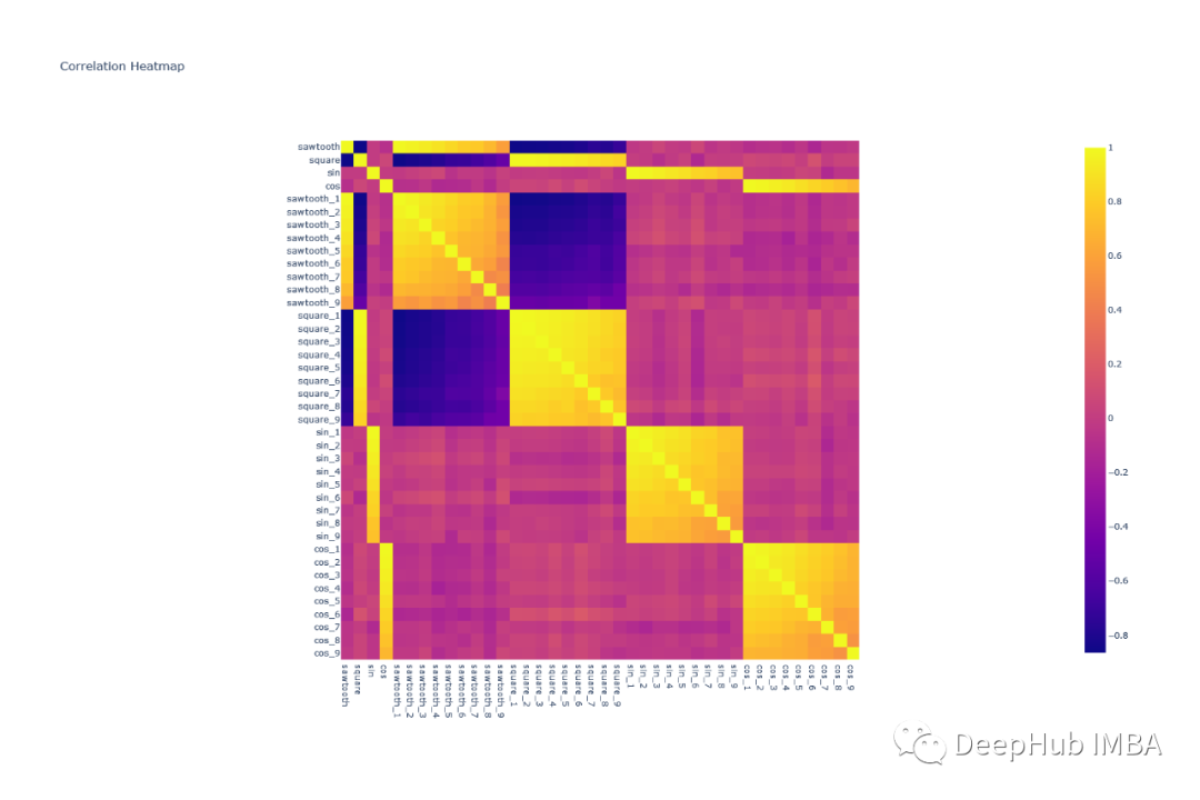
所有的形狀都可以很容易地使用相關熱圖組合在一起——因為類似的波形具有非常高的相關性(sin-sin對),而像sin和cos這樣的波形幾乎沒有相關性。
輪廓分數
通過上面熱圖和分析,根據高相關性分配組看起來是一個好主意,但是我們如何定義相關閾值呢?看起來像一個迭代過程,容易出現不準確和大量的人工工作。
在這種情況下,我們可以使用輪廓分數(Silhouette score),它為執行的聚類分配一個分數。我們的目標是使輪廓分數最大化。
輪廓分數(Silhouette Score)是一種用于評估聚類質量的指標,它可以幫助你確定數據點是否被正確地分配到它們的簇中。較高的輪廓分數表示簇內數據點相互之間更加相似,而不同簇之間的數據點差異更大,這通常是良好的聚類結果。
輪廓分數的計算方法如下:
- 對于每個數據點 i,計算以下兩個值:
- a(i):數據點 i 到同一簇中所有其他點的平均距離(簇內平均距離)。
- b(i):數據點 i 到與其不同簇中的所有簇的平均距離,取最小值(最近簇的平均距離)。
- 然后,計算每個數據點的輪廓系數 s(i),它定義為:s(i) = \frac{b(i) - a(i)}{\max\{a(i), b(i)\}}
- 最后,計算整個數據集的輪廓分數,它是所有數據點的輪廓系數的平均值:\text{輪廓分數} = \frac{1}{N} \sum_{i=1}^{N} s(i)
其中,N 是數據點的總數。
輪廓分數的取值范圍在 -1 到 1 之間,具體含義如下:
- 輪廓分數接近1:表示簇內數據點相似度高,不同簇之間的差異很大,是一個好的聚類結果。
- 輪廓分數接近0:表示數據點在簇內的相似度與簇間的差異相當,可能是重疊的聚類或者不明顯的聚類。
- 輪廓分數接近-1:表示數據點更適合分配到其他簇,不同簇之間的差異相比簇內差異更小,通常是一個糟糕的聚類結果。
一些重要的知識點:
在所有點上的高平均輪廓分數(接近1)表明簇的定義良好且明顯。
低或負的平均輪廓分數(接近-1)表明重疊或形成不良的集群。
0左右的分數表示該點位于兩個簇的邊界上。
聚類
現在讓我們嘗試對時間序列進行分組。我們已經知道存在四種不同的波形,因此理想情況下應該有四個簇。
歐氏距離
pca = decomposition.PCA(n_compnotallow=2)
 pca.fit(df_man_dist_euc)
 df_fc_cleaned_reduced_euc = pd.DataFrame(pca.transform(df_man_dist_euc).transpose(),
                                              index = ['PC_1','PC_2'],
                                              columns = df_man_dist_euc.transpose().columns)

 index = 0
 range_n_clusters = [2, 3, 4, 5, 6, 7, 8]

 # Iterate over different cluster numbers
 for n_clusters in range_n_clusters:
    # Create a subplot with silhouette plot and cluster visualization
    fig, (ax1, ax2) = plt.subplots(1, 2)
    fig.set_size_inches(15, 7)

    # Set the x and y axis limits for the silhouette plot
    ax1.set_xlim([-0.1, 1])
    ax1.set_ylim([0, len(df_man_dist_euc) + (n_clusters + 1) * 10])

    # Initialize the KMeans clusterer with n_clusters and random seed
    clusterer = KMeans(n_clusters=n_clusters, n_init="auto", random_state=10)
    cluster_labels = clusterer.fit_predict(df_man_dist_euc)

    # Calculate silhouette score for the current cluster configuration
    silhouette_avg = silhouette_score(df_man_dist_euc, cluster_labels)
    print("For n_clusters =", n_clusters, "The average silhouette_score is :", silhouette_avg)
    sil_score_results.loc[index, ['number_of_clusters', 'Euclidean']] = [n_clusters, silhouette_avg]
    index += 1

    # Calculate silhouette values for each sample
    sample_silhouette_values = silhouette_samples(df_man_dist_euc, cluster_labels)

    y_lower = 10

    # Plot the silhouette plot
    for i in range(n_clusters):
        # Aggregate silhouette scores for samples in the cluster and sort them
        ith_cluster_silhouette_values = sample_silhouette_values[cluster_labels == i]
        ith_cluster_silhouette_values.sort()

        # Set the y_upper value for the silhouette plot
        size_cluster_i = ith_cluster_silhouette_values.shape[0]
        y_upper = y_lower + size_cluster_i

        color = cm.nipy_spectral(float(i) / n_clusters)

        # Fill silhouette plot for the current cluster
        ax1.fill_betweenx(np.arange(y_lower, y_upper), 0, ith_cluster_silhouette_values, facecolor=color, edgecolor=color, alpha=0.7)

        # Label the silhouette plot with cluster numbers
        ax1.text(-0.05, y_lower + 0.5 * size_cluster_i, str(i))
        y_lower = y_upper + 10 # Update y_lower for the next plot

    # Set labels and title for the silhouette plot
    ax1.set_title("The silhouette plot for the various clusters.")
    ax1.set_xlabel("The silhouette coefficient values")
    ax1.set_ylabel("Cluster label")

    # Add vertical line for the average silhouette score
    ax1.axvline(x=silhouette_avg, color="red", linestyle="--")
    ax1.set_yticks([]) # Clear the yaxis labels / ticks
    ax1.set_xticks([-0.1, 0, 0.2, 0.4, 0.6, 0.8, 1])

    # Plot the actual clusters
    colors = cm.nipy_spectral(cluster_labels.astype(float) / n_clusters)
    ax2.scatter(df_fc_cleaned_reduced_euc.transpose().iloc[:, 0], df_fc_cleaned_reduced_euc.transpose().iloc[:, 1],
                marker=".", s=30, lw=0, alpha=0.7, c=colors, edgecolor="k")

    # Label the clusters and cluster centers
    centers = clusterer.cluster_centers_
    ax2.scatter(centers[:, 0], centers[:, 1], marker="o", c="white", alpha=1, s=200, edgecolor="k")

    for i, c in enumerate(centers):
        ax2.scatter(c[0], c[1], marker="$%d$" % i, alpha=1, s=50, edgecolor="k")

    # Set labels and title for the cluster visualization
    ax2.set_title("The visualization of the clustered data.")
    ax2.set_xlabel("Feature space for the 1st feature")
    ax2.set_ylabel("Feature space for the 2nd feature")

    # Set the super title for the whole plot
    plt.suptitle("Silhouette analysis for KMeans clustering on sample data with n_clusters = %d" % n_clusters,
                  fnotallow=14, fnotallow="bold")

 plt.savefig('sil_score_eucl.png')
 plt.show()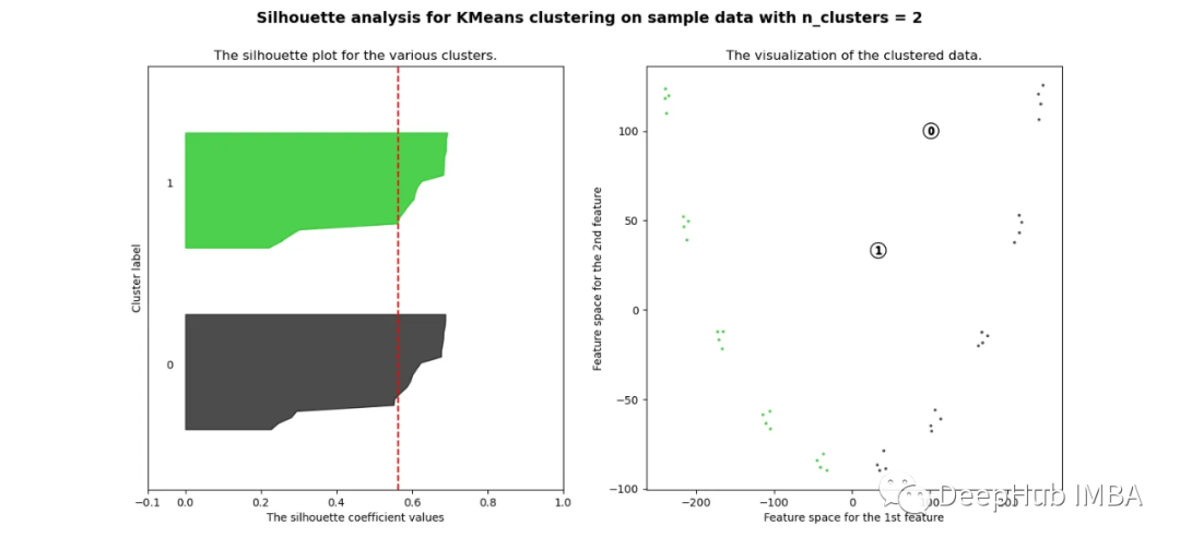
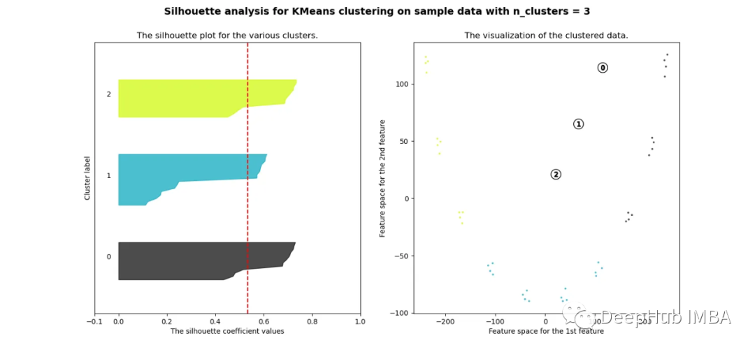
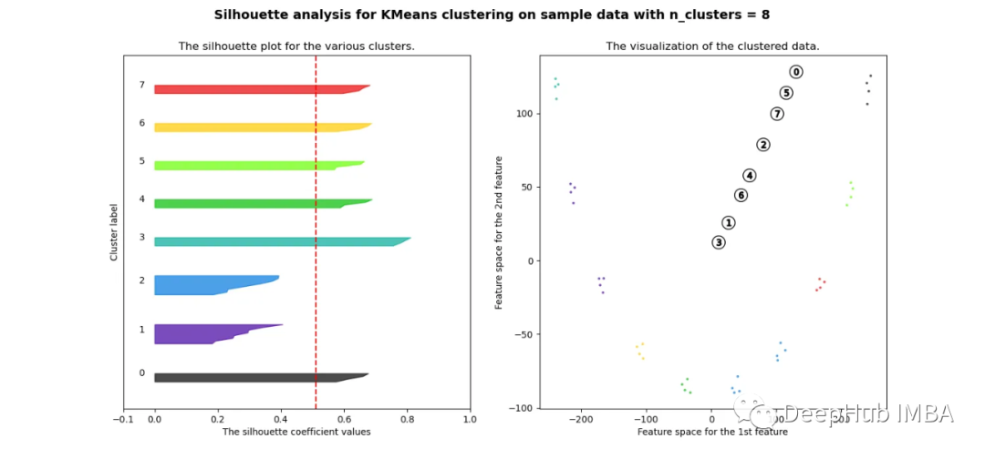
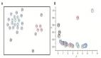
可以看到無論分成多少簇,數據都是混合的,并不能為任何數量的簇提供良好的輪廓分數。這與我們基于歐幾里得距離熱圖的初步評估的預期一致
相關性
pca = decomposition.PCA(n_compnotallow=2)
 pca.fit(df_man_dist_corr)
 df_fc_cleaned_reduced_corr = pd.DataFrame(pca.transform(df_man_dist_corr).transpose(),
                                              index = ['PC_1','PC_2'],
                                              columns = df_man_dist_corr.transpose().columns)

 index=0
 range_n_clusters = [2,3,4,5,6,7,8]
 for n_clusters in range_n_clusters:
    # Create a subplot with 1 row and 2 columns
    fig, (ax1, ax2) = plt.subplots(1, 2)
    fig.set_size_inches(15, 7)

    # The 1st subplot is the silhouette plot
    # The silhouette coefficient can range from -1, 1 but in this example all
    # lie within [-0.1, 1]
    ax1.set_xlim([-0.1, 1])
    # The (n_clusters+1)*10 is for inserting blank space between silhouette
    # plots of individual clusters, to demarcate them clearly.
    ax1.set_ylim([0, len(df_man_dist_corr) + (n_clusters + 1) * 10])

    # Initialize the clusterer with n_clusters value and a random generator
    # seed of 10 for reproducibility.
    clusterer = KMeans(n_clusters=n_clusters, n_init="auto", random_state=10)
    cluster_labels = clusterer.fit_predict(df_man_dist_corr)

    # The silhouette_score gives the average value for all the samples.
    # This gives a perspective into the density and separation of the formed
    # clusters
    silhouette_avg = silhouette_score(df_man_dist_corr, cluster_labels)
    print(
        "For n_clusters =",
        n_clusters,
        "The average silhouette_score is :",
        silhouette_avg,
    )
    sil_score_results.loc[index,['number_of_clusters','corrlidean']] = [n_clusters,silhouette_avg]
    index=index+1

    sample_silhouette_values = silhouette_samples(df_man_dist_corr, cluster_labels)

    y_lower = 10
    for i in range(n_clusters):
        # Aggregate the silhouette scores for samples belonging to
        # cluster i, and sort them
        ith_cluster_silhouette_values = sample_silhouette_values[cluster_labels == i]

        ith_cluster_silhouette_values.sort()

        size_cluster_i = ith_cluster_silhouette_values.shape[0]
        y_upper = y_lower + size_cluster_i

        color = cm.nipy_spectral(float(i) / n_clusters)
        ax1.fill_betweenx(
            np.arange(y_lower, y_upper),
            0,
            ith_cluster_silhouette_values,
            facecolor=color,
            edgecolor=color,
            alpha=0.7,
        )

        # Label the silhouette plots with their cluster numbers at the middle
        ax1.text(-0.05, y_lower + 0.5 * size_cluster_i, str(i))

        # Compute the new y_lower for next plot
        y_lower = y_upper + 10 # 10 for the 0 samples

    ax1.set_title("The silhouette plot for the various clusters.")
    ax1.set_xlabel("The silhouette coefficient values")
    ax1.set_ylabel("Cluster label")

    # The vertical line for average silhouette score of all the values
    ax1.axvline(x=silhouette_avg, color="red", linestyle="--")

    ax1.set_yticks([]) # Clear the yaxis labels / ticks
    ax1.set_xticks([-0.1, 0, 0.2, 0.4, 0.6, 0.8, 1])

    # 2nd Plot showing the actual clusters formed
    colors = cm.nipy_spectral(cluster_labels.astype(float) / n_clusters)

    ax2.scatter(
        df_fc_cleaned_reduced_corr.transpose().iloc[:, 0],
        df_fc_cleaned_reduced_corr.transpose().iloc[:, 1], marker=".", s=30, lw=0, alpha=0.7, c=colors, edgecolor="k"
    )

 #     for i in range(len(df_fc_cleaned_cleaned_reduced.transpose().iloc[:, 0])):
 #                         ax2.annotate(list(df_fc_cleaned_cleaned_reduced.transpose().index)[i],
 #                                     (df_fc_cleaned_cleaned_reduced.transpose().iloc[:, 0][i],
 #                                       df_fc_cleaned_cleaned_reduced.transpose().iloc[:, 1][i] + 0.2))

    # Labeling the clusters
    centers = clusterer.cluster_centers_
    # Draw white circles at cluster centers
    ax2.scatter(
        centers[:, 0],
        centers[:, 1],
        marker="o",
        c="white",
        alpha=1,
        s=200,
        edgecolor="k",
    )

    for i, c in enumerate(centers):
        ax2.scatter(c[0], c[1], marker="$%d$" % i, alpha=1, s=50, edgecolor="k")

    ax2.set_title("The visualization of the clustered data.")
    ax2.set_xlabel("Feature space for the 1st feature")
    ax2.set_ylabel("Feature space for the 2nd feature")

    plt.suptitle(
        "Silhouette analysis for KMeans clustering on sample data with n_clusters = %d"
        % n_clusters,
        fnotallow=14,
        fnotallow="bold",
    )

 plt.show()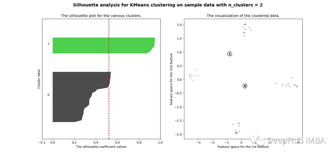
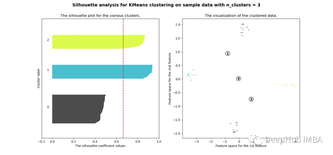
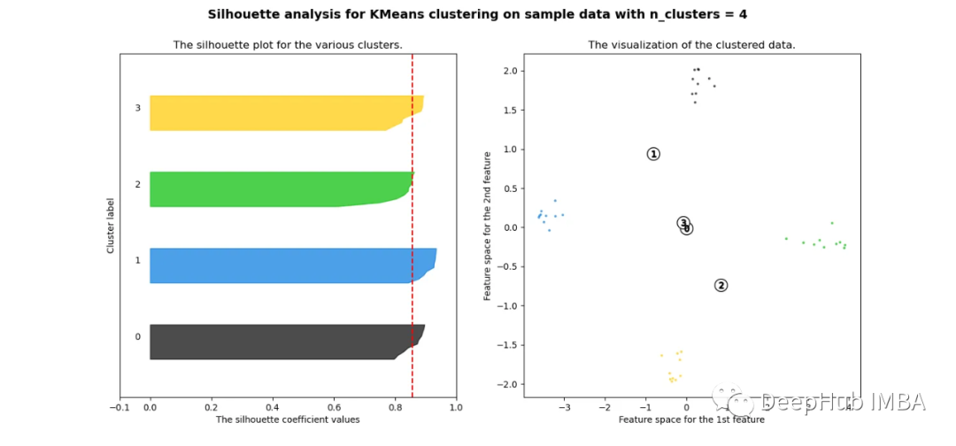
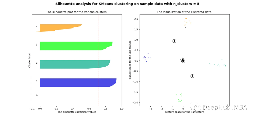
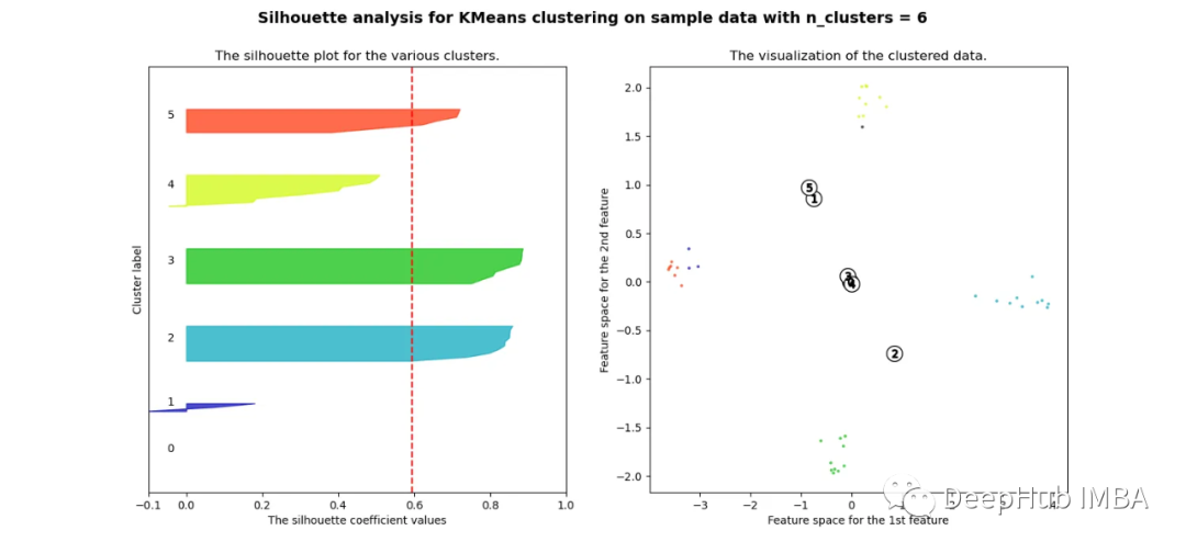
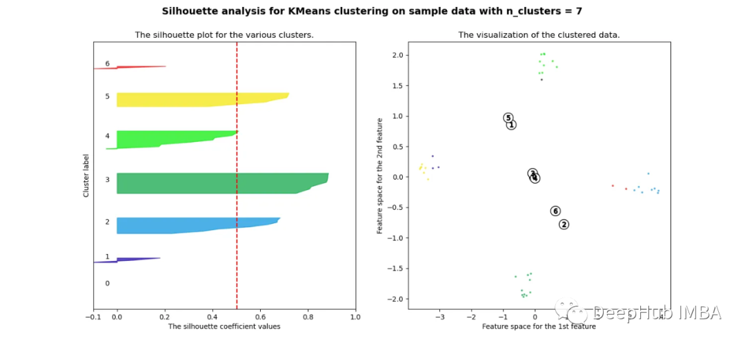
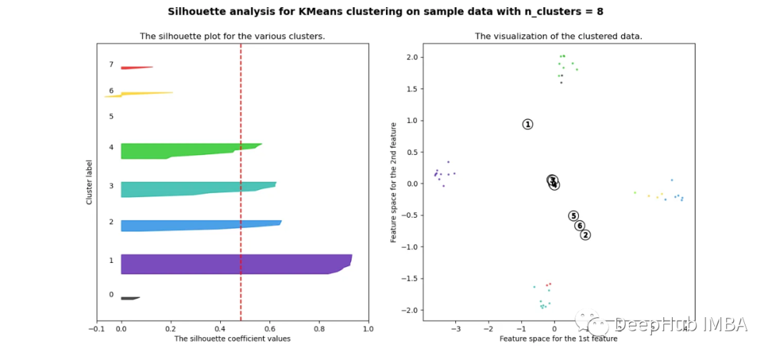
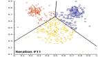
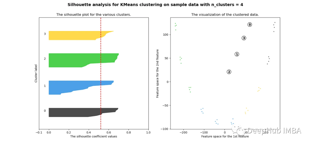
當選擇的簇數為4時,我們可以清楚地看到分離的簇,其他結果通常比歐氏距離要好得多。
歐幾里得距離與相關廓形評分的比較
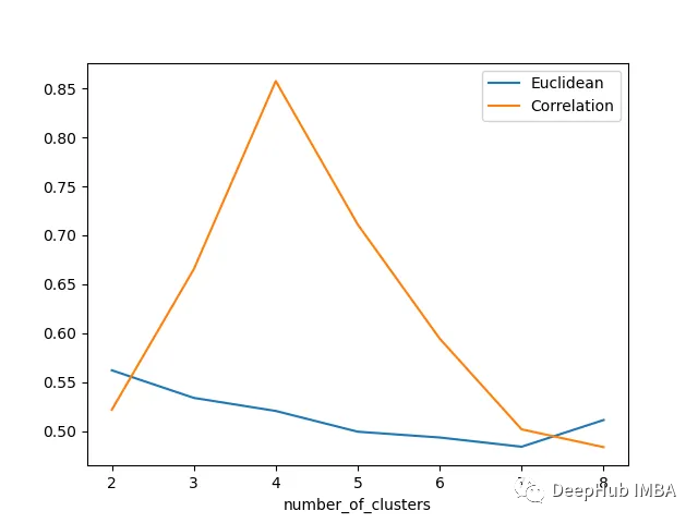
輪廓分數表明基于相關性的距離矩陣在簇數為4時效果最好,而在歐氏距離的情況下效果就不那么明顯了結論
總結
在本文中,我們研究了如何使用歐幾里得距離和相關度量執行時間序列聚類,并觀察了這兩種情況下的結果如何變化。如果我們在評估聚類時結合Silhouette,我們可以使聚類步驟更加客觀,因為它提供了一種很好的直觀方式來查看聚類的分離情況。