教你用Python創建瀑布圖

介紹
對于繪制某些類型的數據來說,瀑布圖是一種十分有用的工具。不足為奇的是,我們可以使用Pandas和matplotlib創建一個可重復的瀑布圖。
在往下進行之前,我想先告訴大家我指代的是哪種類型的圖表。我將建立一個維基百科文章中描述的2D瀑布圖。
這種圖表的一個典型的用處是顯示開始值和結束值之間起“橋梁”作用的+和-的值。因為這個原因,財務人員有時會將其稱為一個橋梁。跟我之前所采用的其他例子相似,這種類型的繪圖在Excel中不容易生成,當然肯定有生成它的方法,但是不容易記住。
關于瀑布圖需要記住的關鍵點是:它本質上是一個堆疊在一起的條形圖,不過特殊的一點是,它有一個空白底欄,所以頂部欄會“懸浮”在空中。那么,讓我們開始吧。
創建圖表
首先,執行標準的輸入,并確保IPython能顯示matplot圖。
- import numpy as np
- import pandas as pd
- import matplotlib.pyplot as plt
- %matplotlib inline
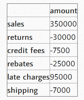
設置我們想畫出瀑布圖的數據,并將其加載到數據幀(DataFrame)中。
數據需要以你的起始值開始,但是你需要給出最終的總數。我們將在下面計算它。
- index = ['sales','returns','credit fees','rebates','late charges','shipping']
- data = {'amount': [350000,-30000,-7500,-25000,95000,-7000]}
- trans = pd.DataFrame(data=data,index=index)
我使用了IPython中便捷的display函數來更簡單地控制我要顯示的內容。
- from IPython.display import display
- display(trans)
瀑布圖的***技巧是計算出底部堆疊條形圖的內容。有關這一點,我從stackoverflow上的討論中學到很多。
首先,我們得到累積和。
- display(trans.amount.cumsum())
- sales 350000
- returns 320000
- credit fees 312500
- rebates 287500
- late charges 382500
- shipping 375500
- Name: amount, dtype: int64
這看起來不錯,但我們需要將一個地方的數據轉移到右邊。
- blank=trans.amount.cumsum().shift(1).fillna(0)
- display(blank)
- sales 0
- returns 350000
- credit fees 320000
- rebates 312500
- late charges 287500
- shipping 382500
- Name: amount, dtype: float64
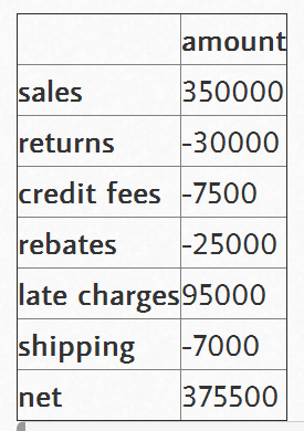
我們需要向trans和blank數據幀中添加一個凈總量。
- total = trans.sum().amount
- trans.loc["net"] = total
- blank.loc["net"] = total
- display(trans)
- display(blank)
- sales 0
- returns 350000
- credit fees 320000
- rebates 312500
- late charges 287500
- shipping 382500
- net 375500
- Name: amount, dtype: float64
創建我們用來顯示變化的步驟。
- step = blank.reset_index(drop=True).repeat(3).shift(-1)
- step[1::3] = np.nan
- display(step)
- 0 0
- 0 NaN
- 0 350000
- 1 350000
- 1 NaN
- 1 320000
- 2 320000
- 2 NaN
- 2 312500
- 3 312500
- 3 NaN
- 3 287500
- 4 287500
- 4 NaN
- 4 382500
- 5 382500
- 5 NaN
- 5 375500
- 6 375500
- 6 NaN
- 6 NaN
- Name: amount, dtype: float64
對于“net”行,為了不使堆疊加倍,我們需要確保blank值為0。
- blank.loc["net"] = 0
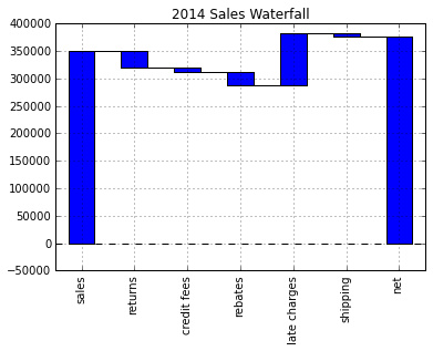
然后,將其畫圖,看一下什么樣子。
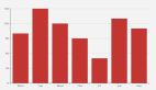
- my_plot = trans.plot(kind='bar', stacked=True, bottom=blank,legend=None, title="2014 Sales Waterfall")
- my_plot.plot(step.index, step.values,'k')
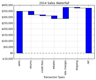
看起來相當不錯,但是讓我們試著格式化Y軸,以使其更具有可讀性。為此,我們使用FuncFormatter和一些Python2.7+的語法來截斷小數并向格式中添加一個逗號。
- def money(x, pos):
- 'The two args are the value and tick position'
- return "${:,.0f}".format(x)
- from matplotlib.ticker import FuncFormatter
- formatter = FuncFormatter(money)
然后,將其組合在一起。
- my_plot = trans.plot(kind='bar', stacked=True, bottom=blank,legend=None, title="2014 Sales Waterfall")
- my_plot.plot(step.index, step.values,'k')
- my_plot.set_xlabel("Transaction Types")
- my_plot.yaxis.set_major_formatter(formatter)
#p#
完整腳本
基本圖形能夠正常工作,但是我想添加一些標簽,并做一些小的格式修改。下面是我最終的腳本:
- import numpy as np
- import pandas as pd
- import matplotlib.pyplot as plt
- from matplotlib.ticker import FuncFormatter
- #Use python 2.7+ syntax to format currency
- def money(x, pos):
- 'The two args are the value and tick position'
- return "${:,.0f}".format(x)
- formatter = FuncFormatter(money)
- #Data to plot. Do not include a total, it will be calculated
- index = ['sales','returns','credit fees','rebates','late charges','shipping']
- data = {'amount': [350000,-30000,-7500,-25000,95000,-7000]}
- #Store data and create a blank series to use for the waterfall
- trans = pd.DataFrame(data=data,index=index)
- blank = trans.amount.cumsum().shift(1).fillna(0)
- #Get the net total number for the final element in the waterfall
- total = trans.sum().amount
- trans.loc["net"]= total
- blank.loc["net"] = total
- #The steps graphically show the levels as well as used for label placement
- step = blank.reset_index(drop=True).repeat(3).shift(-1)
- step[1::3] = np.nan
- #When plotting the last element, we want to show the full bar,
- #Set the blank to 0
- blank.loc["net"] = 0
- #Plot and label
- my_plot = trans.plot(kind='bar', stacked=True, bottom=blank,legend=None, figsize=(10, 5), title="2014 Sales Waterfall")
- my_plot.plot(step.index, step.values,'k')
- my_plot.set_xlabel("Transaction Types")
- #Format the axis for dollars
- my_plot.yaxis.set_major_formatter(formatter)
- #Get the y-axis position for the labels
- y_height = trans.amount.cumsum().shift(1).fillna(0)
- #Get an offset so labels don't sit right on top of the bar
- max = trans.max()
- neg_offset = max / 25
- pos_offset = max / 50
- plot_offset = int(max / 15)
- #Start label loop
- loop = 0
- for index, row in trans.iterrows():
- # For the last item in the list, we don't want to double count
- if row['amount'] == total:
- y = y_height[loop]
- else:
- y = y_height[loop] + row['amount']
- # Determine if we want a neg or pos offset
- if row['amount'] > 0:
- y += pos_offset
- else:
- y -= neg_offset
- my_plot.annotate("{:,.0f}".format(row['amount']),(loop,y),ha="center")
- loop+=1
- #Scale up the y axis so there is room for the labels
- my_plot.set_ylim(0,blank.max()+int(plot_offset))
- #Rotate the labels
- my_plot.set_xticklabels(trans.index,rotation=0)
- my_plot.get_figure().savefig("waterfall.png",dpi=200,bbox_inches='tight')
運行該腳本將生成下面這個漂亮的圖表:
***的想法
如果你之前不熟悉瀑布圖,希望這個示例能夠向你展示它到底是多么有用。我想,可能一些人會覺得對于一個圖表來說需要這么多的腳本代碼有點糟糕。在某些方面,我同意這種想法。如果你僅僅只是做一個瀑布圖,而以后不會再碰它,那么你還是繼續用Excel中的方法吧。
然而,如果瀑布圖真的很有用,并且你需要將它復制給100個客戶,將會怎么樣呢?接下來你將要怎么做呢?此時使用 Excel將會是一個挑戰,而使用本文中的腳本來創建100個不同的表格將相當容易。再次說明,這一程序的真正價值在于,當你需要擴展這個解決方案時,它 能夠便于你創建一個易于復制的程序。
我真的很喜歡學習更多Pandas、matplotlib和IPothon的知識。我很高興這種方法能夠幫到你,并希望其他人也可以從中學習到一些知識,并將這一課所學應用到他們的日常工作中。